Component categories · Data display
Dashboard and data display components
Chart cards, data tables, comparison tables and status panels for admin panels, dashboards and data pages.
16 total · Updated
Where to use them
Dashboards, data tables, chart cards, comparison tables and status panels.
How to use them
- Open any component to see its live preview and switch between dark and light backgrounds.
- Click Copy prompt and paste it into Claude Code, Cursor, Codex or Trae. The model reads your project, rewrites the component for your framework and wires colors and fonts to your design tokens.
- Or install them from your terminal with the 8pt CLI, or just describe what you need in an editor connected to 8pt MCP.
npm i -g @8pt-dev/cli
8pt login
8pt search "Dashboards and data display"
8pt add suiyun-dot-globe
All 16 dashboard and data display components
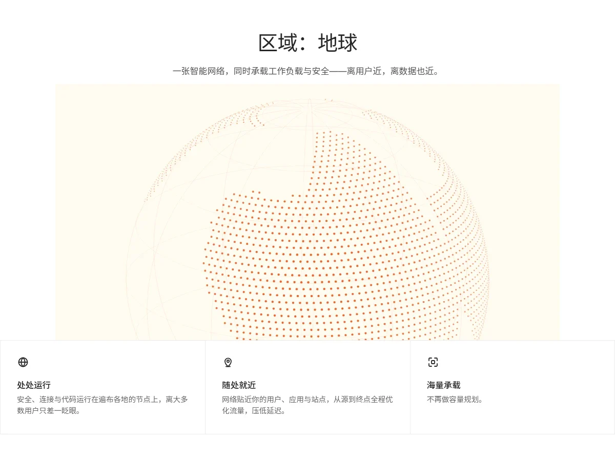
- Dotted Globe Features Dotted Globe Features
Under a centered headline and subhead, a slowly rotating dotted globe: orange dots form fictional continents, faint graticule lines show through from the back, set in a cream frame. Below, a three-part feature strip with line icons, short titles and descriptions; hovered cells warm up.
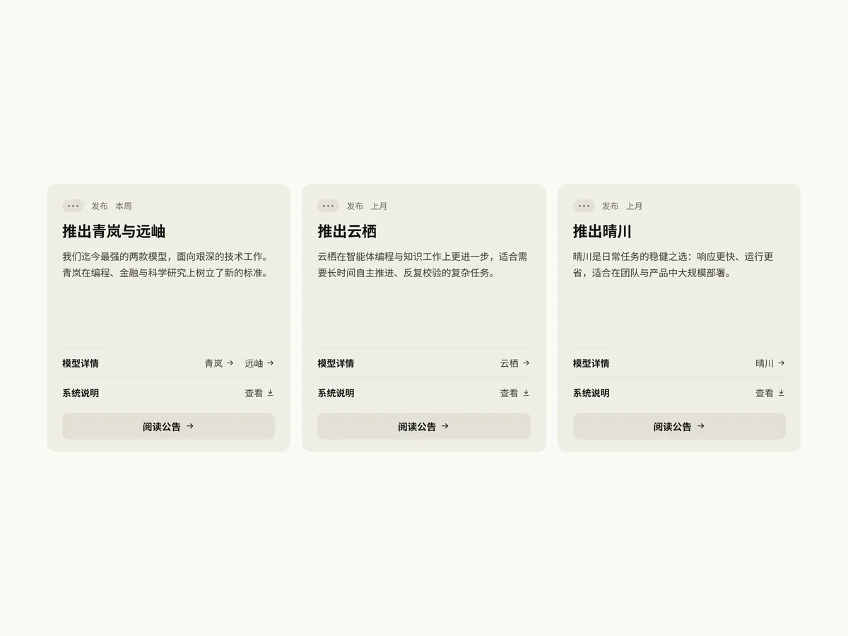
- Release Spec Cards Release Spec Cards
Three beige-gray rounded announcement cards: pill tag, section and date on top, bold title and summary, two hairline-separated links for model details and system notes, and a full-width Read announcement button at the bottom. Cards lift on hover and the arrow slides right.
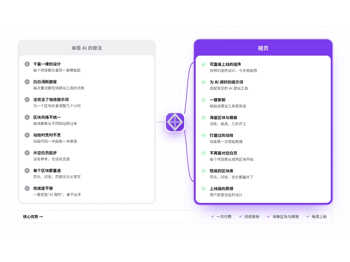
- Versus Compare Panel Versus Compare Panel
A gray The usual way list with crosses sits next to a purple Our way list with checks; a floating badge in the middle connects to the right with curves. On entering the viewport the curves draw and the right-hand items slide in one by one, with a key-advantage bar along the bottom.
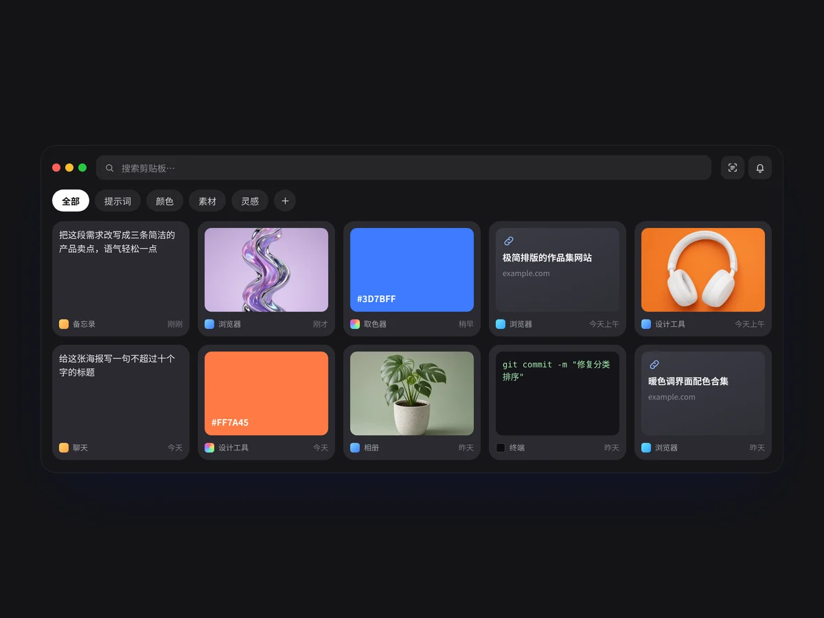
- Clip Library Window Clip Library Window
A clipboard library in a dark frosted app window: search box and tool buttons on top, category tags that filter text, color and asset cards, live filtering as you type, a Copied toast when you click any card, and cards floating in one after another.
- Four Answer Window Four Answer Window
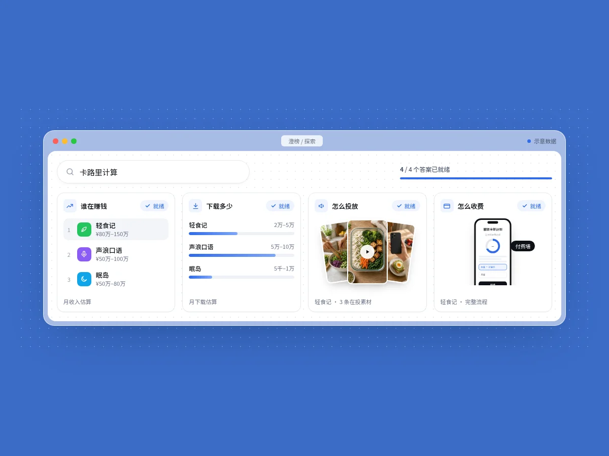
A four-panel answer view in a frosted browser window: the search box cycles keywords, a progress bar fills step by step and four cards switch from Loading to Ready one after another, showing a revenue ranking, a downloads bar chart, an ad creative fan and a paywall phone. Two columns on narrow screens.
- Top Apps Toggle Board Top Apps Toggle Board
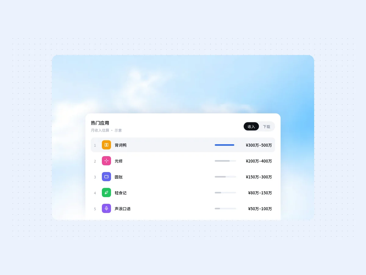
A ranking card floating over a sky image, with a black slider in the top right switching between Revenue and Downloads. Values fade as they switch and the bars resize smoothly; the first row is highlighted in the accent color. On narrow screens the bars hide and only values remain.
- Three Step Flow Three Step Flow
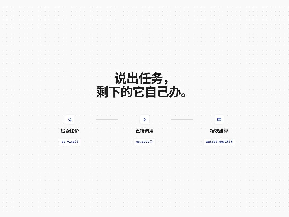
Three icon nodes with code labels in a row, joined by thin lines, switching to a vertical stack on narrow screens. Good for explaining a three-stage flow like search, call and settle.
- Agent Chat Window Agent Chat Window
An AI agent demo window. Pill tabs switch between five tasks; on the left a user request bubble and a ring progress go from Processing to Done before the delivery note types out; on the right the 9:16 preview swaps to match, and the input placeholder changes too.
- Mac File Window Mac File Window
A native-feeling Mac file manager window: sidebar, grouping switch (none / kind / date) and colorful file icons. Click Tidy and loose files fly into sorted folders, with an undo toast at the bottom.
- Disk Cleanup Panel Disk Cleanup Panel
A segmented storage bar with a grouped checklist: Safe to remove is checked by default, Your call is not. Checking items resizes the striped segments live; moving to Trash gives back disk space, and one click undoes it.
- Shortcut Keycaps Shortcut Keycaps
Keyboard shortcuts as 3D keycap cards. When idle each card demos a key press; once the pointer is inside, pressing ⌘, ⌥, ⇧ or a letter on your real keyboard presses the matching keycap, and a card lights up when its whole combo is held.
- Compare Table Compare Table
An Us vs the default comparison table: our column has a soft highlight, checkmarks light up row by row as it scrolls into view, and hovering a row brightens it for easy reading.
- Orbit Timeline Orbit Timeline
Nodes orbit slowly along a track while staying upright; click one to pause and open that stage’s description.
- Avatar Stack Avatar Stack
Overlapping member avatars that fan out on hover with name bubbles and a +N count at the end. Avatars are initials on gradients, no images needed.
- Kanban Column Kanban Column
A two-column kanban: click a card to move it to the other column. FLIP records the before and after positions and tweens with transform only, so nothing jumps.
- Code Diff Card Code Diff Card
A review-style change card: file name, added and removed counts, a diff that fades in line by line, hover highlighting, and one-click copy of the new code.
FAQ
Can I use 8pt dashboard and data display components in React, Vue or Next.js projects?
Yes. Component source is native HTML, CSS and a little JS. Hand the copied prompt to your model and it rewrites the component for your stack in React, Vue, Svelte and so on, wiring colors and fonts to your existing design tokens.
How do I add dashboard and data display components to my project?
Three ways: copy the prompt on the component page for your model; run it with the 8pt CLI 8pt add <Components slug>; or connect 8pt MCP and just describe what you need in the chat. Copying prompts, the CLI and MCP need the Builder plan (Builder is $9//month, $25//quarter or $ $75//year; there’s alsoFounding Lifetime $179, one payment, limited to 100 seats).
How do I make a dashboard easier to read?
Start with the three to five most important metric cards, then trend charts, then detailed tables. Keep number alignment, decimals and units consistent across the page.
Can I use them in commercial projects?
Yes. You can use code you copy or install in your own projects, including commercial ones, but you can’t resell 8pt content as a whole or build a competing asset library with it.