Component categories · Pricing
Pricing table components
Plan cards, monthly / yearly toggles and plan comparisons for SaaS pricing pages. Open one to preview it, then copy the prompt and the model wires it to your prices and design tokens.
8 total · Updated
Where to use them
SaaS pricing pages, upgrade dialogs, plan comparisons and monthly / yearly toggles.
How to use them
- Open any component to see its live preview and switch between dark and light backgrounds.
- Click Copy prompt and paste it into Claude Code, Cursor, Codex or Trae. The model reads your project, rewrites the component for your framework and wires colors and fonts to your design tokens.
- Or install them from your terminal with the 8pt CLI, or just describe what you need in an editor connected to 8pt MCP.
npm i -g @8pt-dev/cli
8pt login
8pt search "Pricing tables"
8pt add suiyun-tab-pricing
All 8 pricing table components
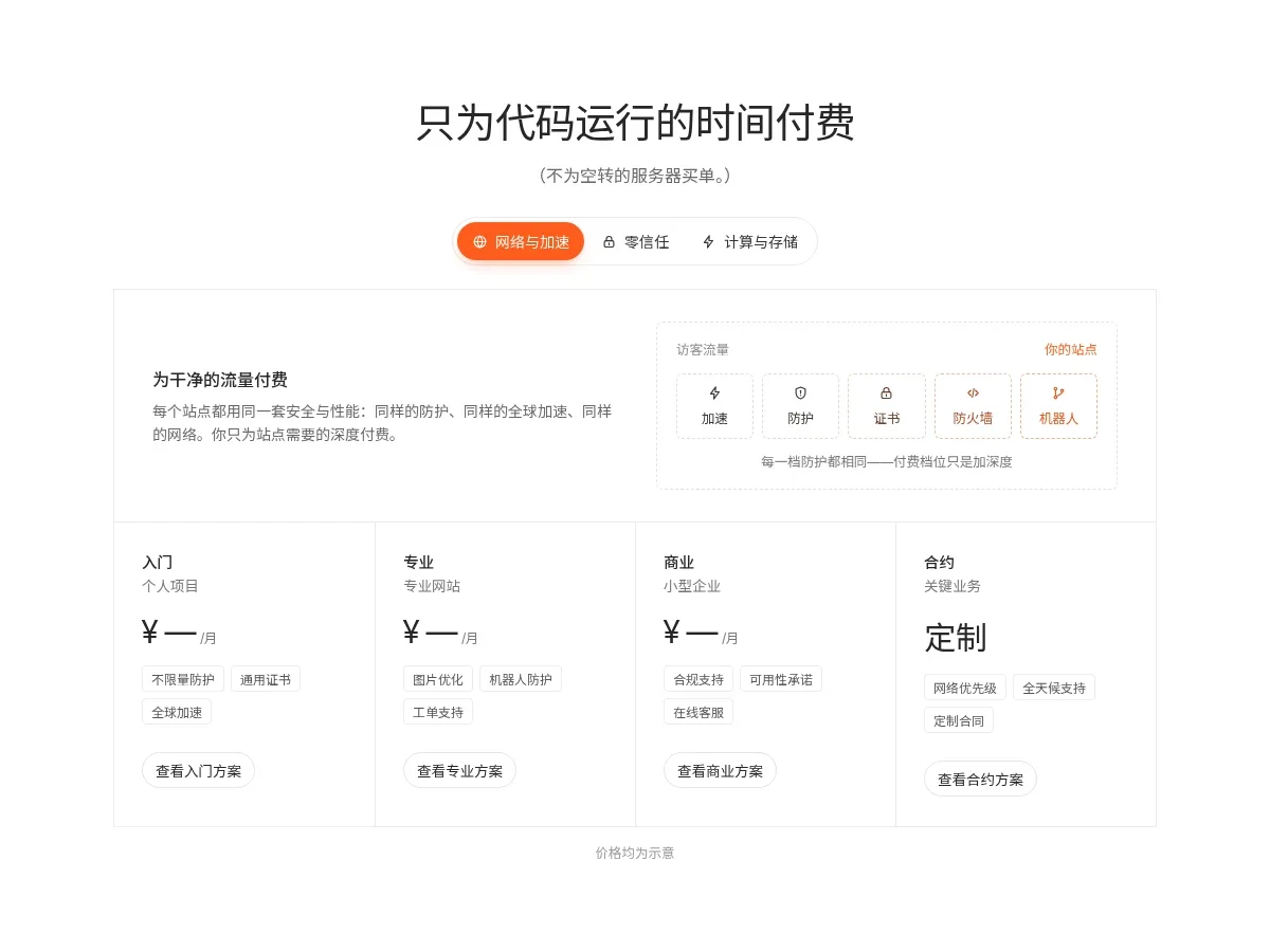
- Segmented Pricing Tiers Segmented Pricing Tiers
A pill segmented control switches between three product pricing groups. Each opens with a description and a flow illustration on the right (visitor traffic passing through capability chips, or a wait-versus-compute bar), followed by hairline tier columns with title, audience, sample price, capability tags and an outline button.
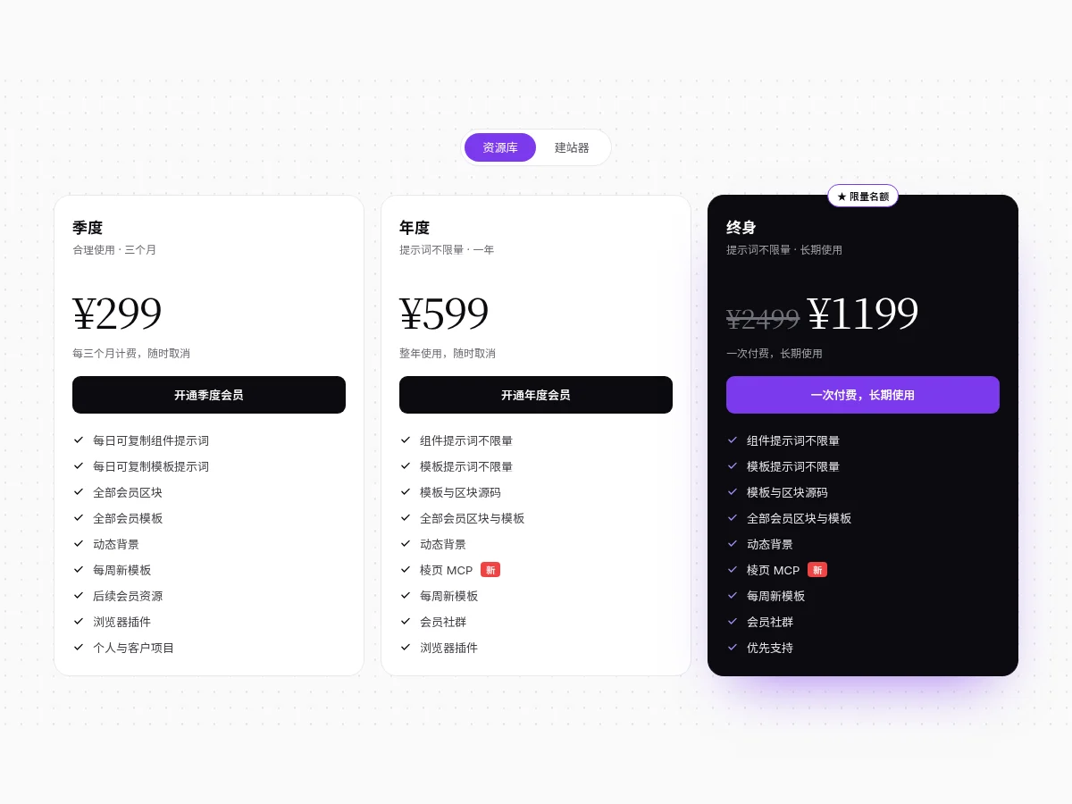
- Tri Plan Pricing Tri Plan Pricing
Quarterly, yearly and lifetime pricing tiers with large serif prices and struck-through list prices. A slider switch on top toggles between Library and Site builder and the prices fade to update; the recommended tier is a black card with a purple button and a Limited seats badge.
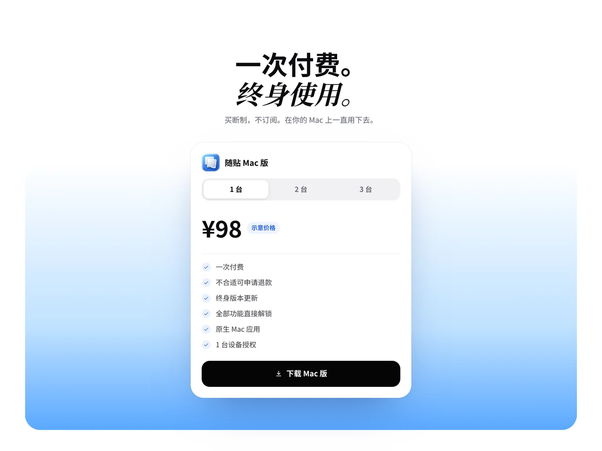
- Device Price Card Device Price Card
A one-time-purchase pricing section: a two-line serif italic headline and a white price card with a 1 / 2 / 3 device segmented switch, the price rolling between values and labeled as a sample price, then a checklist and a black download button, over a sky that turns blue toward the bottom.
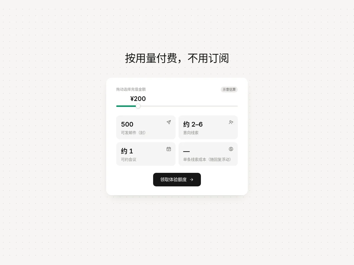
- Usage Slider Calculator Usage Slider Calculator
A usage-based pricing estimator card: drag the green slider to choose an amount, with the amount label following the thumb, while four tiles below convert it live into sample figures for sendable emails, qualified leads and bookable meetings. A black button sits at the bottom.
- Dual Plan Pricing Dual Plan Pricing
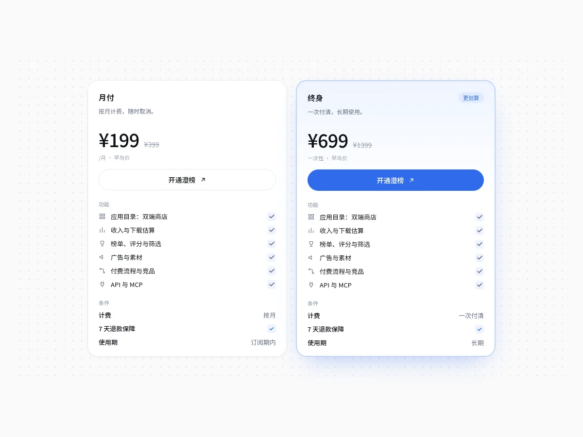
Monthly and lifetime price cards side by side: large prices with struck-through list prices, feature lists with a line icon and blue check on every row, and billing and term conditions at the bottom. The recommended plan stands out with a light blue gradient, heavier border and primary button.
- Electric Border Pricing Electric Border Pricing
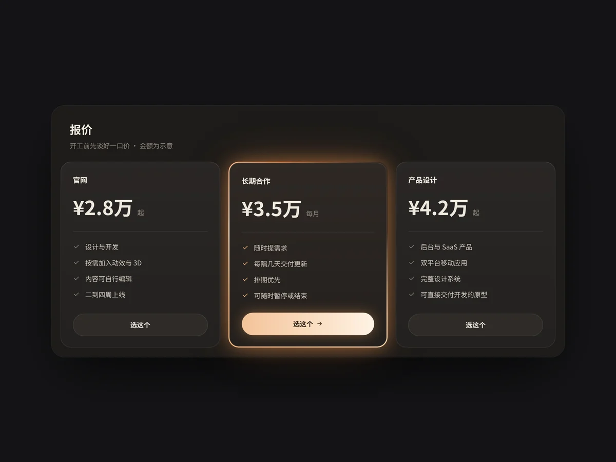
Three pricing cards: the recommended tier stands out with a rotating warm orange light-streak border and outer glow while the other two stay as restrained dark cards. Cards lift slightly on hover and clicking a button switches it to Selected. Amounts are shown as samples; one column on narrow screens.
- Ticket Pricing Ticket Pricing
A one-time-purchase price card styled like a ticket: product specs on the left, a tear-off stub on the right, with half-circle notches top and bottom. Switching between one and two licenses updates the list price, sale price and button amount together.
- Pricing Toggle Pricing Toggle
A sliding billing-period toggle. Prices roll vertically without shifting the layout.
FAQ
Can I use 8pt pricing table components in React, Vue or Next.js projects?
Yes. Component source is native HTML, CSS and a little JS. Hand the copied prompt to your model and it rewrites the component for your stack in React, Vue, Svelte and so on, wiring colors and fonts to your existing design tokens.
How do I add pricing table components to my project?
Three ways: copy the prompt on the component page for your model; run it with the 8pt CLI 8pt add <Components slug>; or connect 8pt MCP and just describe what you need in the chat. Copying prompts, the CLI and MCP need the Builder plan (Builder is $9//month, $25//quarter or $ $75//year; there’s alsoFounding Lifetime $179, one payment, limited to 100 seats).
How many plans should a pricing page compare?
For most products, three tiers or fewer are easiest to compare. Highlight the recommended tier, describe each tier’s differences as concrete features, and put a comparison table and FAQ below. If yearly billing has a discount, default the toggle to yearly.
Can I use them in commercial projects?
Yes. You can use code you copy or install in your own projects, including commercial ones, but you can’t resell 8pt content as a whole or build a competing asset library with it.