Component categories · Media
Media and gallery components
Image comparisons, video showcases, work galleries and carousels. Made for portfolios, product demos and AI generation platforms.
12 total · Updated


Where to use them
Image comparisons, video showcases, galleries, carousels and media cards.
How to use them
- Open any component to see its live preview and switch between dark and light backgrounds.
- Click Copy prompt and paste it into Claude Code, Cursor, Codex or Trae. The model reads your project, rewrites the component for your framework and wires colors and fonts to your design tokens.
- Or install them from your terminal with the 8pt CLI, or just describe what you need in an editor connected to 8pt MCP.
npm i -g @8pt-dev/cli
8pt login
8pt search "Media and galleries"
8pt add crossfade-media-stage
All 12 media and gallery components
- Crossfade Media Stage Crossfade Media Stage
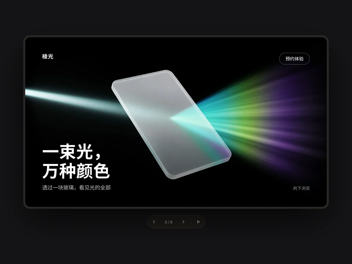
A full-bleed image stage: three large images crossfade and slowly zoom while a centered serif headline, description and two buttons appear with each scene. A thin progress bar bottom left shows each scene’s length and can be clicked to jump; a button bottom right pauses or resumes.
- Tinted Team Cards Tinted Team Cards
Three tall saturated color cards: an original pebble character and a notebook sit on a diagonal-stripe glow, with a translucent tag top left and a short serif usage line at the bottom. The card lifts on hover and the character bobs gently.
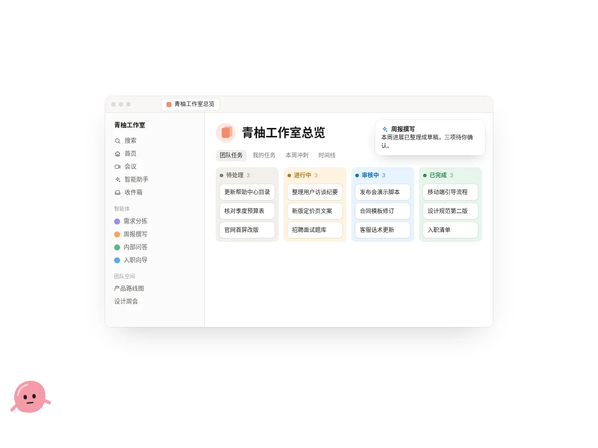
- Kanban Window Mock Kanban Window Mock
A browser window mockup: a workspace sidebar with icons and an agent list on the left; page title, view switcher and a four-column colorful kanban on the right. Every few seconds a card moves to the next column, and agent notifications pop up top right.
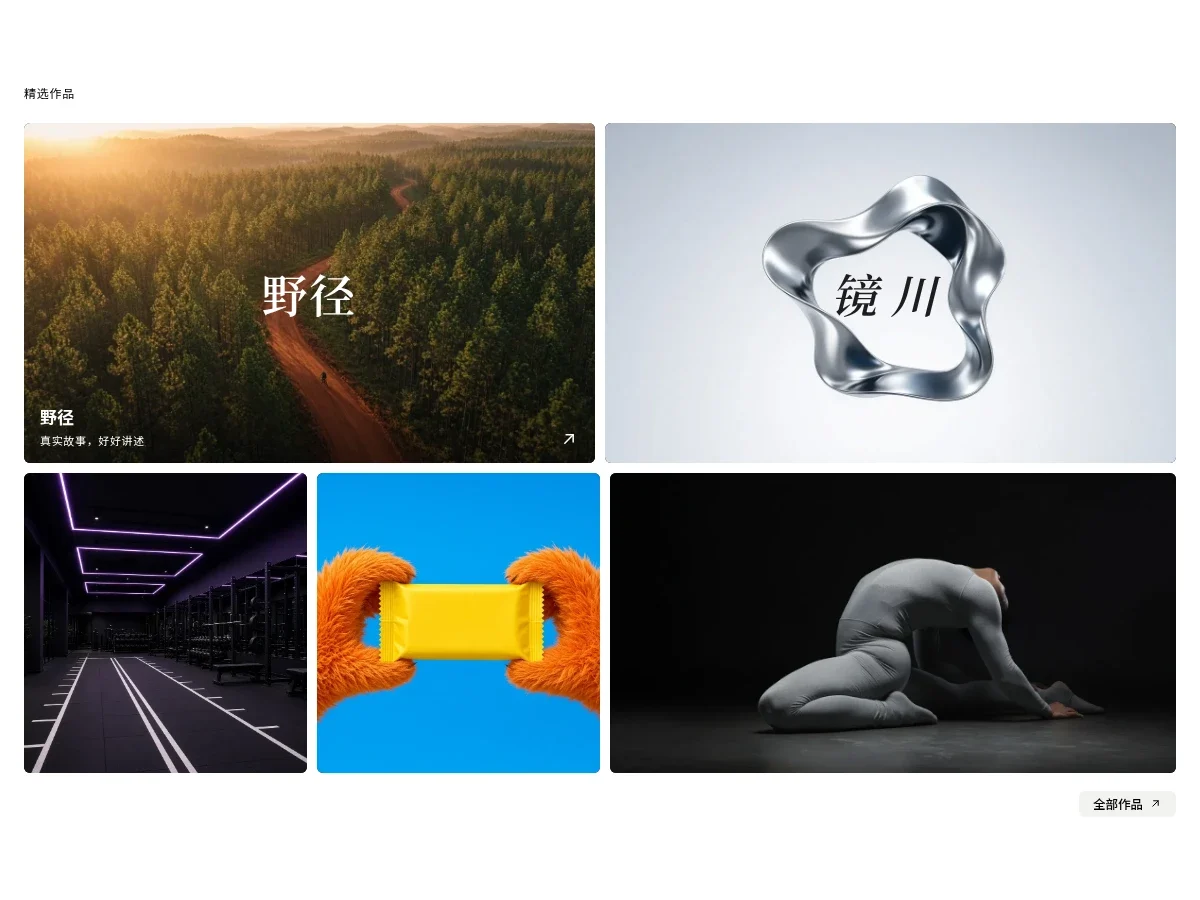
- Hover Reveal Work Grid Hover Reveal Work Grid
A work grid of two large and three small pieces: two wide images on top, then narrow, narrow and wide below. On hover the image zooms slowly, the bottom darkens and the project name, a monospace subtitle and a corner arrow appear; a light gray pill button closes it off bottom right.
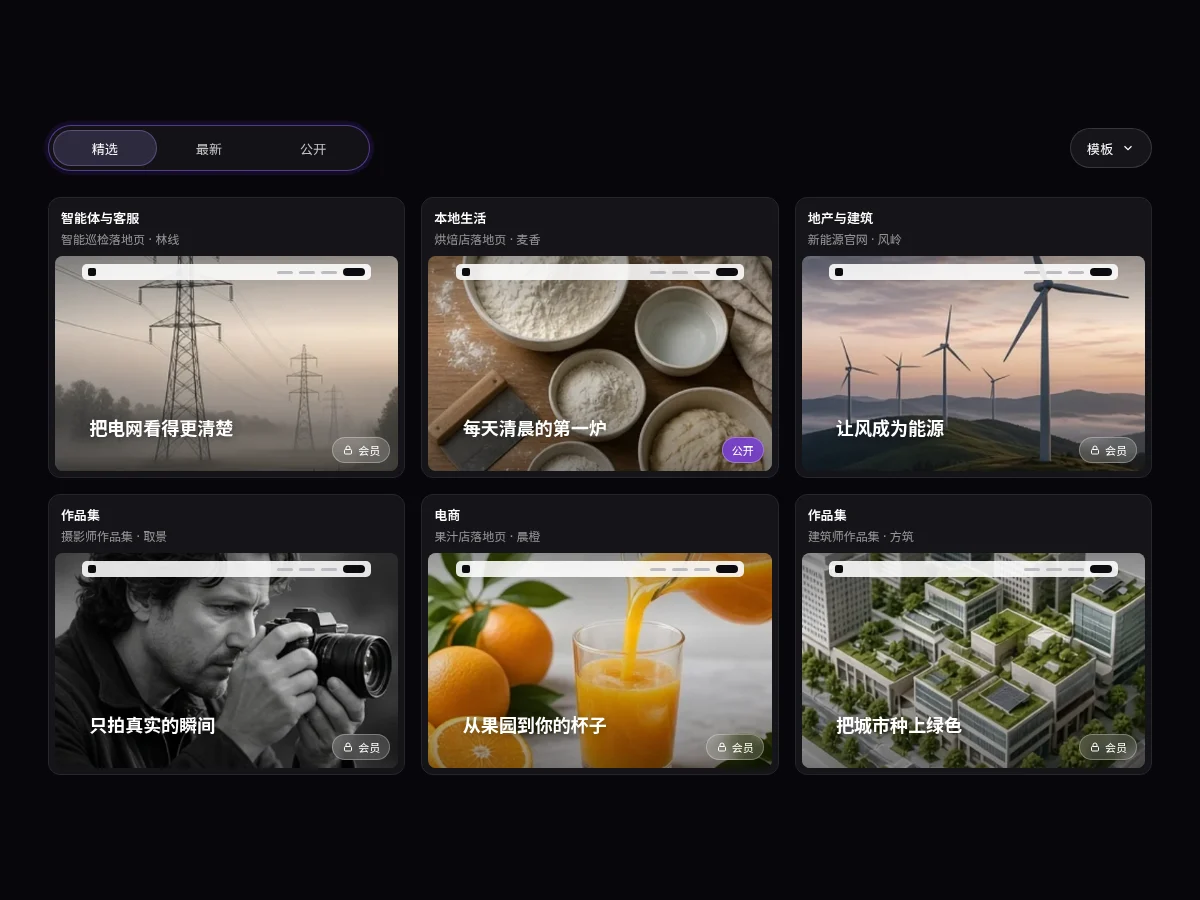
- Template Card Grid Template Card Grid
A template card grid with sliding segmented tabs and a dropdown: each card has a category, a title and a site thumbnail overlaid with a mini nav bar, a big headline and a member badge. Switching tabs fades and reflows the cards; thumbnails zoom on hover.
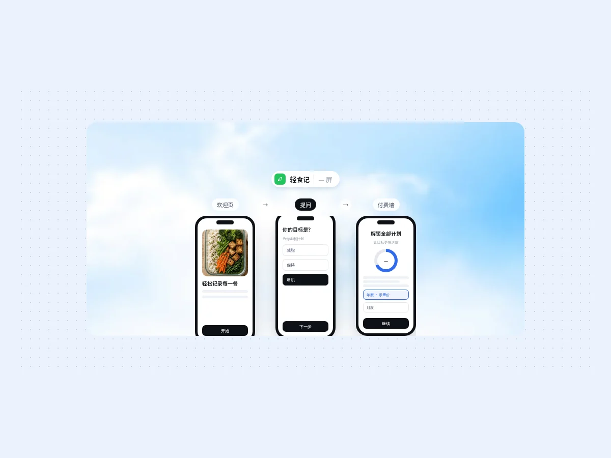
- Paywall Flow Strip Paywall Flow Strip
Three phones show a welcome screen, a question screen and a paywall in turn, with step tags joined by arrows above. The current step rotates on its own and lifts its phone slightly; hover to pick one. Good for explaining onboarding flows and paywall design.
- Gallery Lightbox Stage Gallery Lightbox Stage
A dark frame shows large images at their original aspect ratio; switching zooms the image slightly as it fades in and the text rises. A floating control bar at the bottom has previous, page number, next and autoplay, with a thin progress line while playing and arrow key support.
- Infinite Drag Wall Infinite Drag Wall
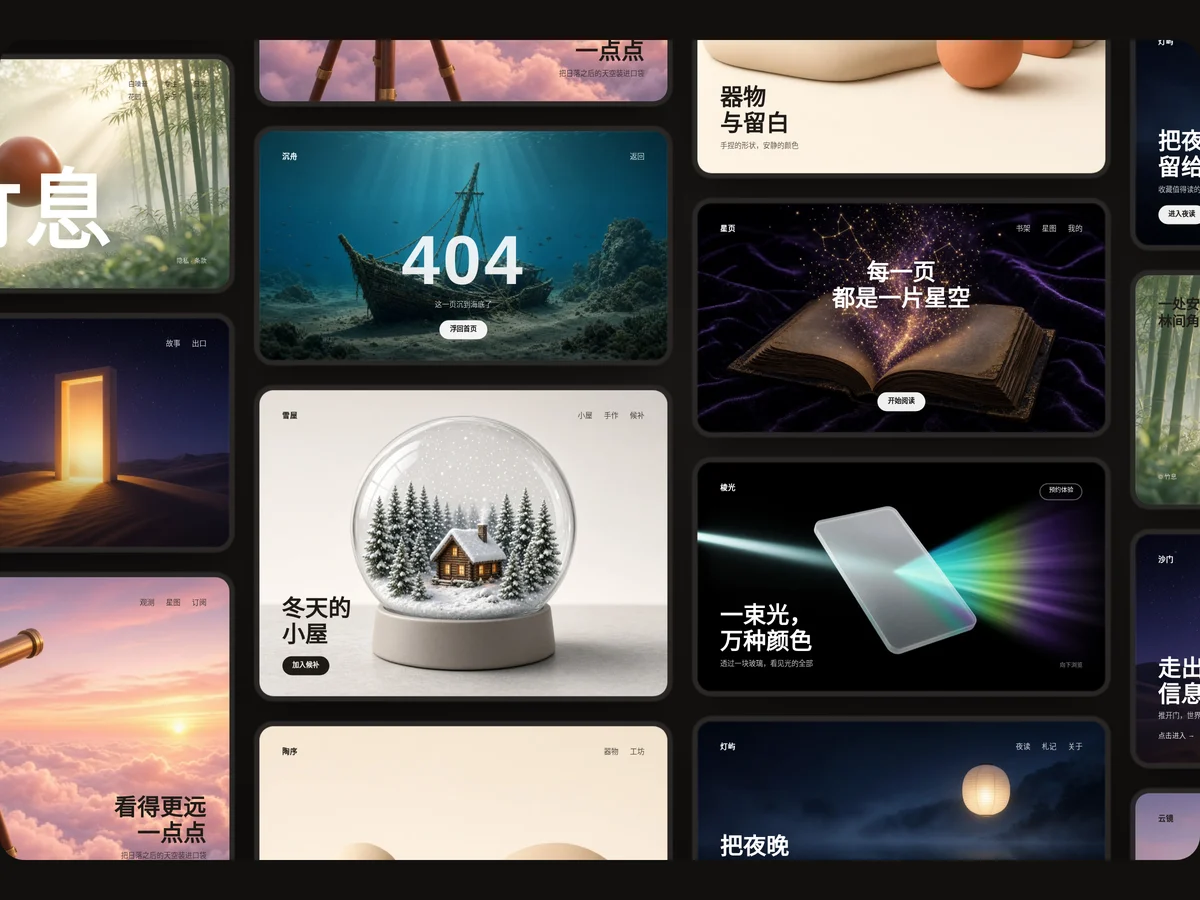
Staggered work cards form a boundless canvas: press and drag in any direction with inertial gliding, or pan with the scroll wheel. Cards fade in by distance; click one to enlarge it and flip left or right. Made for portfolio home pages and inspiration walls.
- Library Browser Mock Library Browser Mock
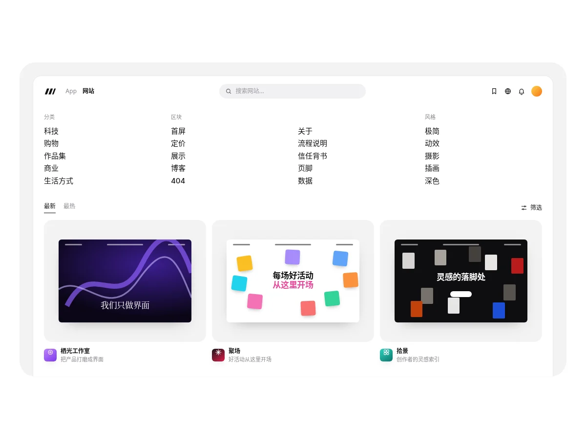
A product browser window inside a light gray rounded frame: a top bar with a segmented switch and search box, four-column category navigation, and Latest / Popular tabs switching three site thumbnail cards that lift slightly on hover.
- Film Strip Carousel Film Strip Carousel
A film strip with orange sprocket holes top and bottom, carrying 16:9 launch cards that advance on their own. Each frame has a slanted headline; on hover the card gets an orange ring, the title changes color and playback pauses. Arrows hide at either end.
- Auto Tab Showcase Auto Tab Showcase
A full-bleed background image with a capability list on the left. The active item shows an orange play triangle and a one-line description; when the progress bar fills it moves to the next item while the background crossfades and slowly zooms in. Click any item to jump; it pauses off-screen.
- Image Compare Image Compare
Drag the divider to compare before and after images, with left and right arrow key support. Clipping uses two opposing translate layers, so size never changes and nothing reflows.
FAQ
Can I use 8pt media and gallery components in React, Vue or Next.js projects?
Yes. Component source is native HTML, CSS and a little JS. Hand the copied prompt to your model and it rewrites the component for your stack in React, Vue, Svelte and so on, wiring colors and fonts to your existing design tokens.
How do I add media and gallery components to my project?
Three ways: copy the prompt on the component page for your model; run it with the 8pt CLI 8pt add <Components slug>; or connect 8pt MCP and just describe what you need in the chat. Copying prompts, the CLI and MCP need the Builder plan (Builder is $9//month, $25//quarter or $ $75//year; there’s alsoFounding Lifetime $179, one payment, limited to 100 seats).
How do I keep image-heavy pages fast?
Lazy-load images below the hero, set width and height to avoid layout shift, and prefer compressed formats like WebP. Videos should be muted by default, and large files shouldn’t autoplay.
Can I use them in commercial projects?
Yes. You can use code you copy or install in your own projects, including commercial ones, but you can’t resell 8pt content as a whole or build a competing asset library with it.