Component categories · Disclosure
FAQ and accordion components
FAQs, accordions and expandable explanations. Answers start collapsed and open with a smooth transition, made for the bottom of pricing and product pages.
7 total · Updated
Where to use them
FAQs, accordions, expandable explanations and grouped settings.
How to use them
- Open any component to see its live preview and switch between dark and light backgrounds.
- Click Copy prompt and paste it into Claude Code, Cursor, Codex or Trae. The model reads your project, rewrites the component for your framework and wires colors and fonts to your design tokens.
- Or install them from your terminal with the 8pt CLI, or just describe what you need in an editor connected to 8pt MCP.
npm i -g @8pt-dev/cli
8pt login
8pt search "FAQ  and accordions"
8pt add dark-accordion-footer
All 7 FAQ and accordion components
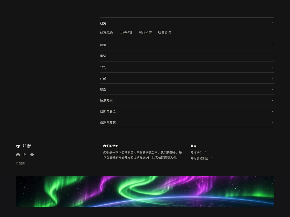
- Dark Accordion Footer Dark Accordion Footer
A large footer on near-black: nine hairline-separated collapsible link groups across two thirds of the width, one open at a time with rotating arrows. The bottom row has the logo with social icons, a mission statement and a sign-in link.
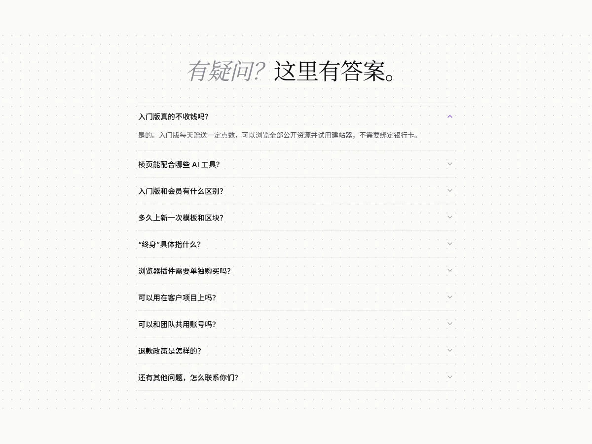
- Chevron FAQ List Chevron FAQ List
A minimal hairline-separated FAQ list built on native details: questions turn purple on hover, the arrow flips and changes color when open, and the answer slides down and fades in. One item open at a time, and it still collapses without JavaScript.
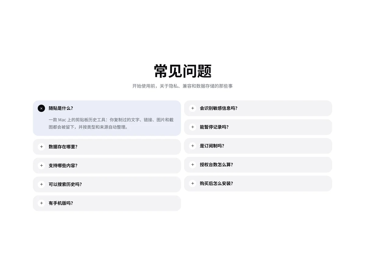
- Two Column FAQ Two Column FAQ
A two-column FAQ accordion: ten light gray rounded items arranged in two columns. Clicking opens an answer and turns the plus into a close icon; one item open at a time, and the open item turns light blue.
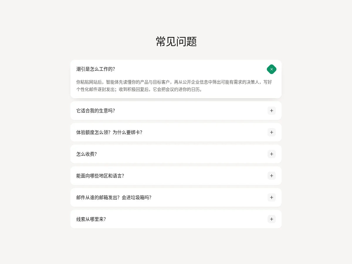
- Soft FAQ Accordion Soft FAQ Accordion
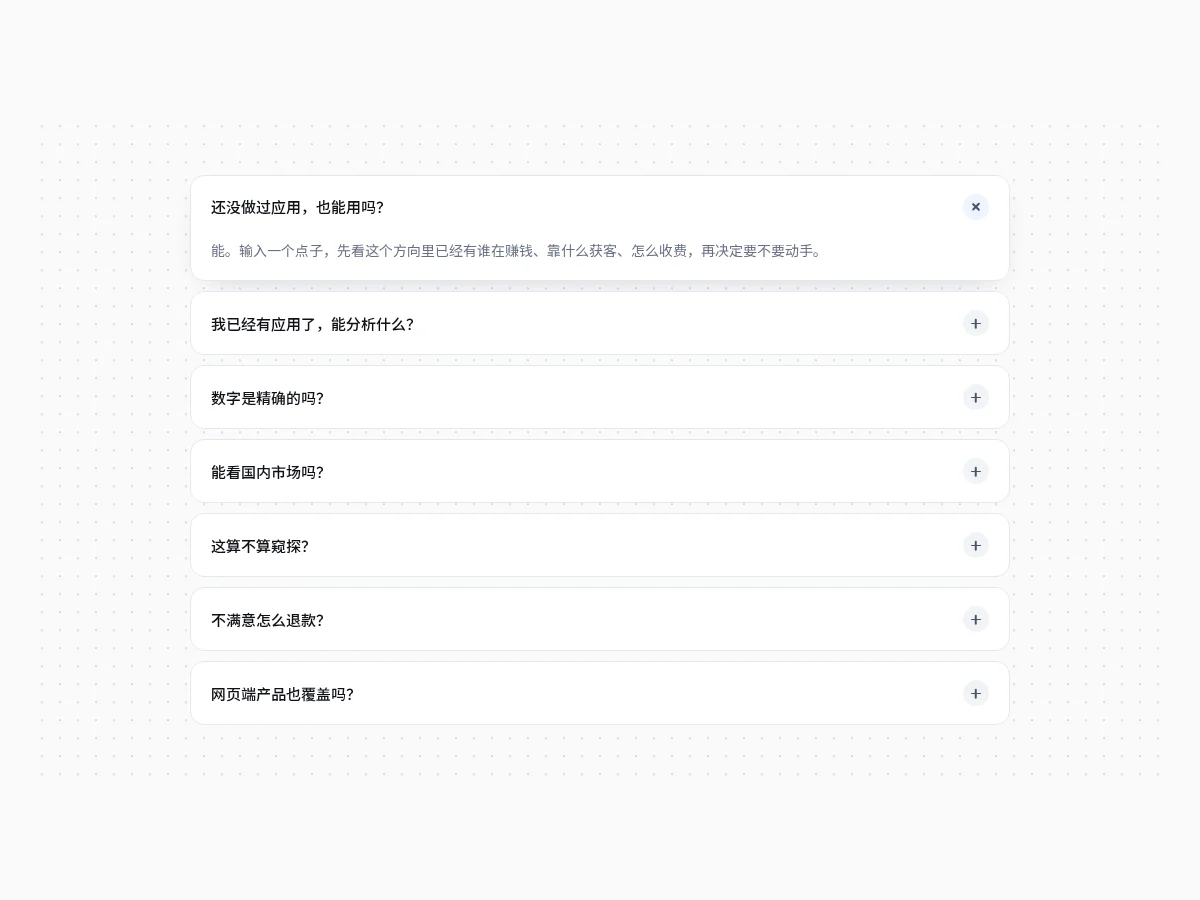
White rounded FAQ items stacked vertically: clicking opens the answer with a height transition, the plus on the right rotates into a cross on a green background and the open item gets a deeper shadow. Several items can be open at once.
- Rounded FAQ Stack Rounded FAQ Stack
A rounded-card FAQ list built on native details, each question in its own card: the plus rotates into a cross when open, the card lifts with a shadow and the answer slides down and fades in. One item open at a time, and it works without JavaScript.
- Plus FAQ Accordion Plus FAQ Accordion
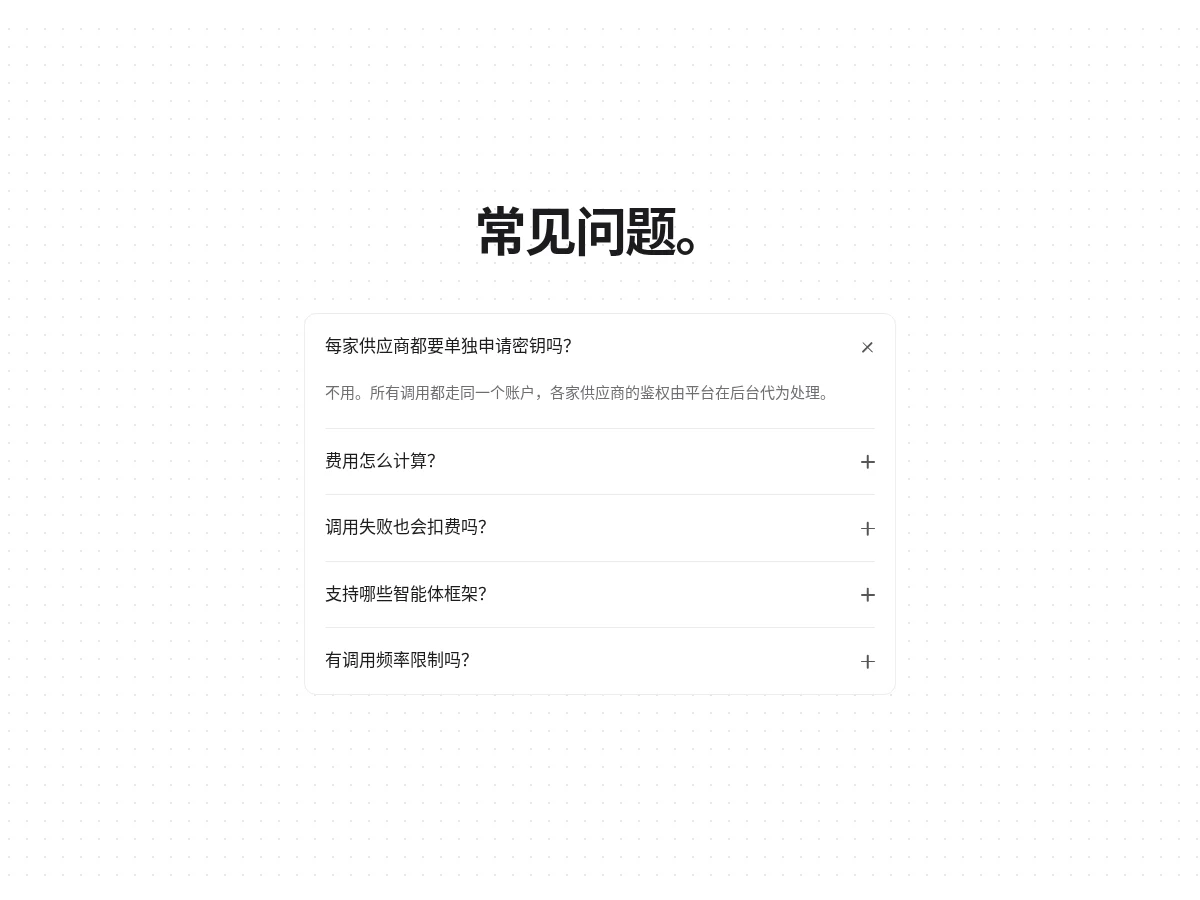
A FAQ list built on native details with hairline dividers: the plus rotates into a cross when open and the answer slides down and fades in. One item open at a time, and it works without JavaScript.
- Accordion Accordion
A single-open accordion: the plus rotates into a cross and content fades in. Fully keyboard accessible.
FAQ
Can I use 8pt FAQ and accordion components in React, Vue or Next.js projects?
Yes. Component source is native HTML, CSS and a little JS. Hand the copied prompt to your model and it rewrites the component for your stack in React, Vue, Svelte and so on, wiring colors and fonts to your existing design tokens.
How do I add FAQ and accordion components to my project?
Three ways: copy the prompt on the component page for your model; run it with the 8pt CLI 8pt add <Components slug>; or connect 8pt MCP and just describe what you need in the chat. Copying prompts, the CLI and MCP need the Builder plan (Builder is $9//month, $25//quarter or $ $75//year; there’s alsoFounding Lifetime $179, one payment, limited to 100 seats).
How many FAQ entries should I write?
Five to eight of the most asked questions is enough: price, refunds or canceling, commercial use, supported tools and how to get in touch. Answer in the first sentence, then add detail.
Can I use them in commercial projects?
Yes. You can use code you copy or install in your own projects, including commercial ones, but you can’t resell 8pt content as a whole or build a competing asset library with it.