Component categories · Cards
Card components
Cards for features, case studies, team members and bento layouts. Hover, light effects and layered motion are all native CSS and JS.
23 total · Updated







Where to use them
Sections that present information in groups: features, case studies and work, team members, article lists.
How to use them
- Open any component to see its live preview and switch between dark and light backgrounds.
- Click Copy prompt and paste it into Claude Code, Cursor, Codex or Trae. The model reads your project, rewrites the component for your framework and wires colors and fonts to your design tokens.
- Or install them from your terminal with the 8pt CLI, or just describe what you need in an editor connected to 8pt MCP.
npm i -g @8pt-dev/cli
8pt login
8pt search "Cards"
8pt add suiyun-deploy-bento
All 23 card components
- Live Deploy Bento Live Deploy Bento
A four-tile bento: new builds keep sliding into a deploy list as statuses move from queued to building to deployed; a solid orange card tells the network story; a shield outline keeps redrawing in the secure-by-default tile; and a terminal in the AI tile types out a background agent’s work log line by line.
- Trio Capability Cards Trio Capability Cards
A headline with three white capability cards: an input with a colorful glow that types by itself, an editor preview where a dashed selection hops between headline and button with the cursor following, and a side menu whose highlight steps through each item.
- Story Stat Carousel Story Stat Carousel
A horizontal customer story carousel: side cards show only a fictional wordmark while the center card expands into a story summary, a quote with a gradient left border, three sample stats, an avatar byline and a read button. Click a side card or the arrows to slide smoothly.
- Collage Topic Cards Collage Topic Cards
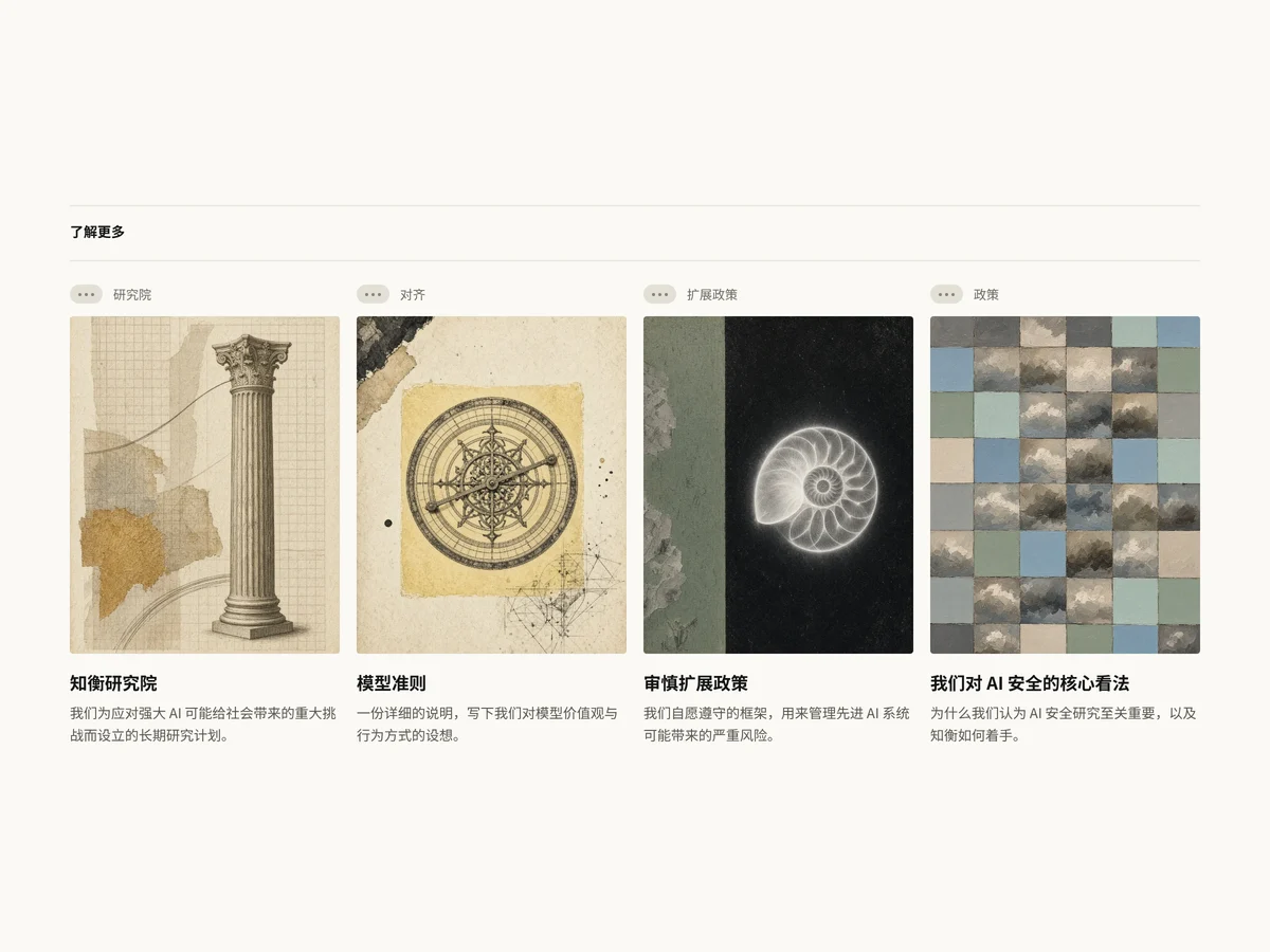
A four-column grid of Learn more feature cards: each has a section label on top, a vintage collage illustration in the middle and a bold title with description below. On hover the illustration zooms slightly and gains saturation and the title gets a thin underline; it drops to two columns, then one, on narrow screens.
- Agent Use Cards Agent Use Cards
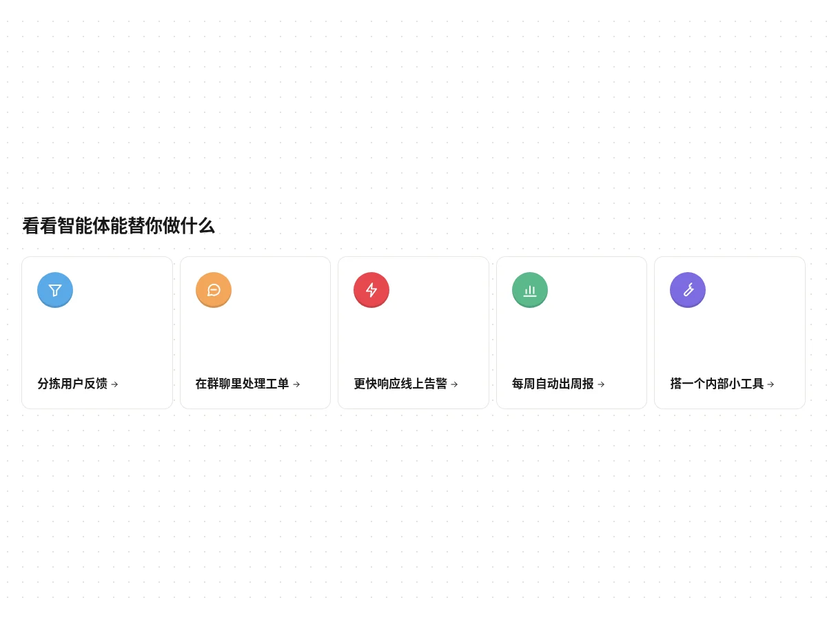
A row of five small white cards with fine borders, each with an inset-shadowed colorful round icon top left and a use-case name with a small arrow at the bottom. Cards lift on hover and the arrow moves right. Good for feature entry points or use-case navigation.
- AI Feature Bento AI Feature Bento
A light gray rounded bento: a meeting notes card with a live transcription waveform, a Q&A card with a typed question and a looping growing bar chart, and a full-width card where a task list and an agent conversation appear in turn beside the title. Arrows move right on hover.
- Tagged Journal Cards Tagged Journal Cards
Three-column article cards: near-square images with a translucent frosted tag in the top right, bold titles and gray serif subtitles below. The third card’s cover is a cluster of floating rendered spheres; images zoom slowly on hover.
- MCP Connect Steps MCP Connect Steps
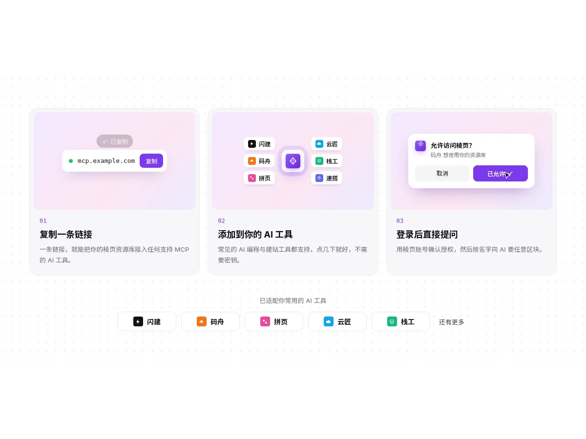
Three step cards that explain setup: copying the link pops a Copied toast, the middle shows a mini tool connection diagram, and in the third an animated cursor clicks Allow on an authorization dialog, which then shows Allowed. A row of supported tool pills sits below.
- Masonry Review Wall Masonry Review Wall
A four-column masonry wall of short reviews: avatar, name with a blue verified badge and a role tag. Cards rise in one by one as they enter the viewport, the whole wall fades out at the bottom, and hovered cards get a purple shadow. Drops to three, two, then one column on narrower screens.
- Builder Feature Cards Builder Feature Cards
A site-builder introduction on a black-to-purple gradient: tag pill, two-tier headline and a prompt input that types itself, then four white feature cards demoing stacked templates, chat bubbles, section swapping and domain publishing, with two action buttons.
- Scenario Metric Cards Scenario Metric Cards
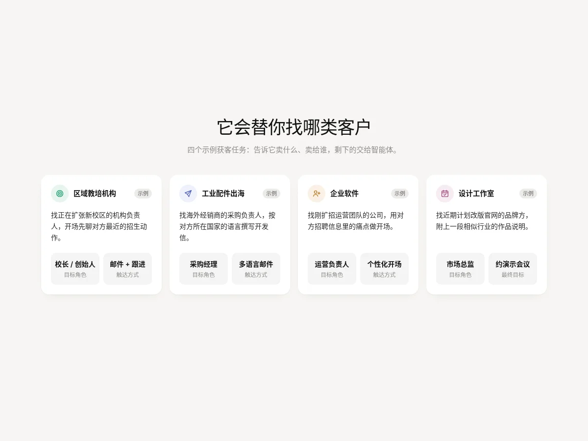
A row of four white rounded cards: a colorful round icon and title, a task description, and two light gray metric tiles at the bottom for target role and outreach channel. Cards lift on hover with a deeper shadow.
- Fading Quote Wall Fading Quote Wall
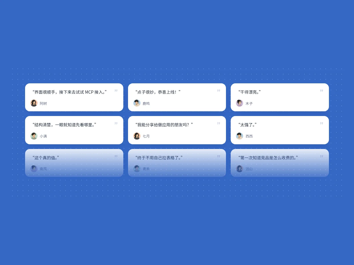
A three-column masonry wall of short review cards: cards rise in one by one on entering the viewport and the wall fades out at the bottom. Each card has a quote icon, avatar and name, and lifts slightly on hover. Two columns or one on narrow screens.
- Library Bento Grid Library Bento Grid
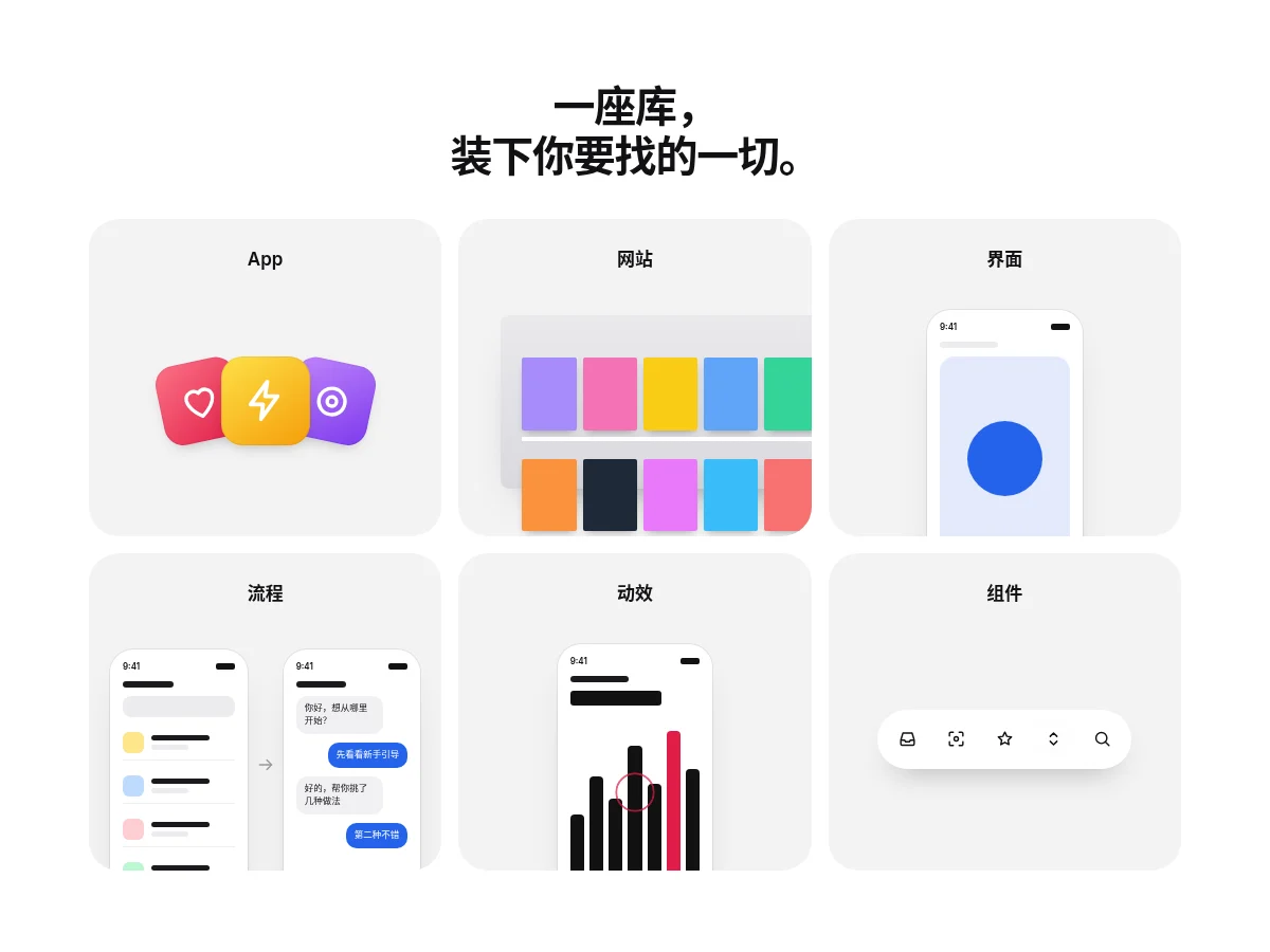
A three-by-two light gray rounded bento, one content type per tile: a fan of app icons, bookshelf-style site thumbnails, a phone screen, a two-screen flow, a pulse animation and a toolbar with rotating highlights. Each tile expands or lifts on hover.
- Branch Tool Grid Branch Tool Grid
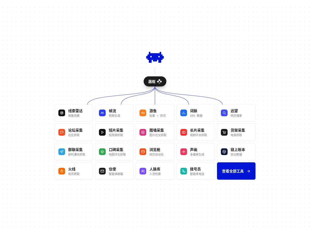
A central node branches with Bézier curves into five columns of tool cards, each with a colorful icon block and small monospace text, lifting slightly on hover, with the last cell finished in the accent color. Good for integration directories and plugin marketplaces.
- Media Bento Grid Media Bento Grid
A six-tile capability bento: one wide image across two columns, one tall image across two rows, then two small and two wide tiles. Every tile is a full-bleed image with a bottom fade; on hover the image slowly zooms and the arrow after the title slides forward.
- Director Art Cards Director Art Cards
Four feature cards drawn in pure CSS, staggered large and small: a twinkling starfield with dashed nodes, an orange dune horizon, a comet crossing the night sky, a pulsing sound wave and breathing lights. No images at all; made for a feature deep-dive section.
- Glass Folder Glass Folder
Frosted-glass folder icons with the content type printed on the front and item count and size below. On hover the folder lifts and the papers inside peek out; when idle the three folders take turns breathing.
- File Preview Cards File Preview Cards
Every file shown as a card with a real preview: a document cover page, a photo, a slide, a spreadsheet, a video frame. An S / M / L switch in the corner resizes the cards; selected cards get an outline.
- Spotlight Card Spotlight Card
A spotlight follows the pointer and lights up the card border. Only transform moves, so scrolling and hovering stay smooth.
- Card Stack Card Stack
Click or swipe the top card and it flies off, then returns to the bottom of the stack.
- Bento Grid Bento Grid
A four-tile feature layout with uneven widths: bars rise one by one, numbers count up, tags rotate. The hovered tile lifts slightly while the others step back.
- Border Beam Card Border Beam Card
A beam of light loops around the card border while the content stays calm. The beam is a rotating conic gradient that only animates transform.
- Tilt Card Tilt Card
The card tilts in 3D with the pointer, the highlight moves the other way and the content layer has parallax. It springs back on leave.
FAQ
Can I use 8pt card components in React, Vue or Next.js projects?
Yes. Component source is native HTML, CSS and a little JS. Hand the copied prompt to your model and it rewrites the component for your stack in React, Vue, Svelte and so on, wiring colors and fonts to your existing design tokens.
How do I add card components to my project?
Three ways: copy the prompt on the component page for your model; run it with the 8pt CLI 8pt add <Components slug>; or connect 8pt MCP and just describe what you need in the chat. Copying prompts, the CLI and MCP need the Builder plan (Builder is $9//month, $25//quarter or $ $75//year; there’s alsoFounding Lifetime $179, one payment, limited to 100 seats).
What if a lot of cards look messy?
Keep one group of cards on the same radius, padding and heading level, and let only one featured card be larger or carry the accent color. Bento layouts create hierarchy through size contrast, not by styling every card differently.
Can I use them in commercial projects?
Yes. You can use code you copy or install in your own projects, including commercial ones, but you can’t resell 8pt content as a whole or build a competing asset library with it.