Component categories · Hero
Hero components
The first screen people see on a landing page or product site: headline, subhead, primary button and animated background. Every one has a live preview; copy the prompt into Claude Code, Cursor or Codex and the model adapts it to your brand.
12 total · Updated

Where to use them
The hero of a product site, SaaS landing page or campaign page: where the headline, subhead and primary button make the first impression.
How to use them
- Open any component to see its live preview and switch between dark and light backgrounds.
- Click Copy prompt and paste it into Claude Code, Cursor, Codex or Trae. The model reads your project, rewrites the component for your framework and wires colors and fonts to your design tokens.
- Or install them from your terminal with the 8pt CLI, or just describe what you need in an editor connected to 8pt MCP.
npm i -g @8pt-dev/cli
8pt login
8pt search "Hero Heroes"
8pt add suiyun-glow-hero
All 12 hero components
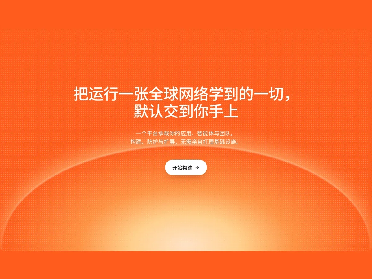
- Dot Matrix Glow Hero Dot Matrix Glow Hero
A rounded orange hero block: a fine dot texture twinkles slowly while a warm yellow glow breathes at the bottom. Two lines of centered white headline, a two-line subhead and a white pill button that lifts on hover. On narrow screens it switches to left-aligned type and a full-width button.
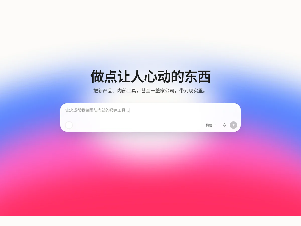
- Aurora Prompt Hero Aurora Prompt Hero
An aurora hero on off-white made of slowly drifting blurred blue, pink and red glows. Under the centered headline and subhead sits a large rounded input whose placeholder types itself, with attachment, mode dropdown, voice and send buttons.
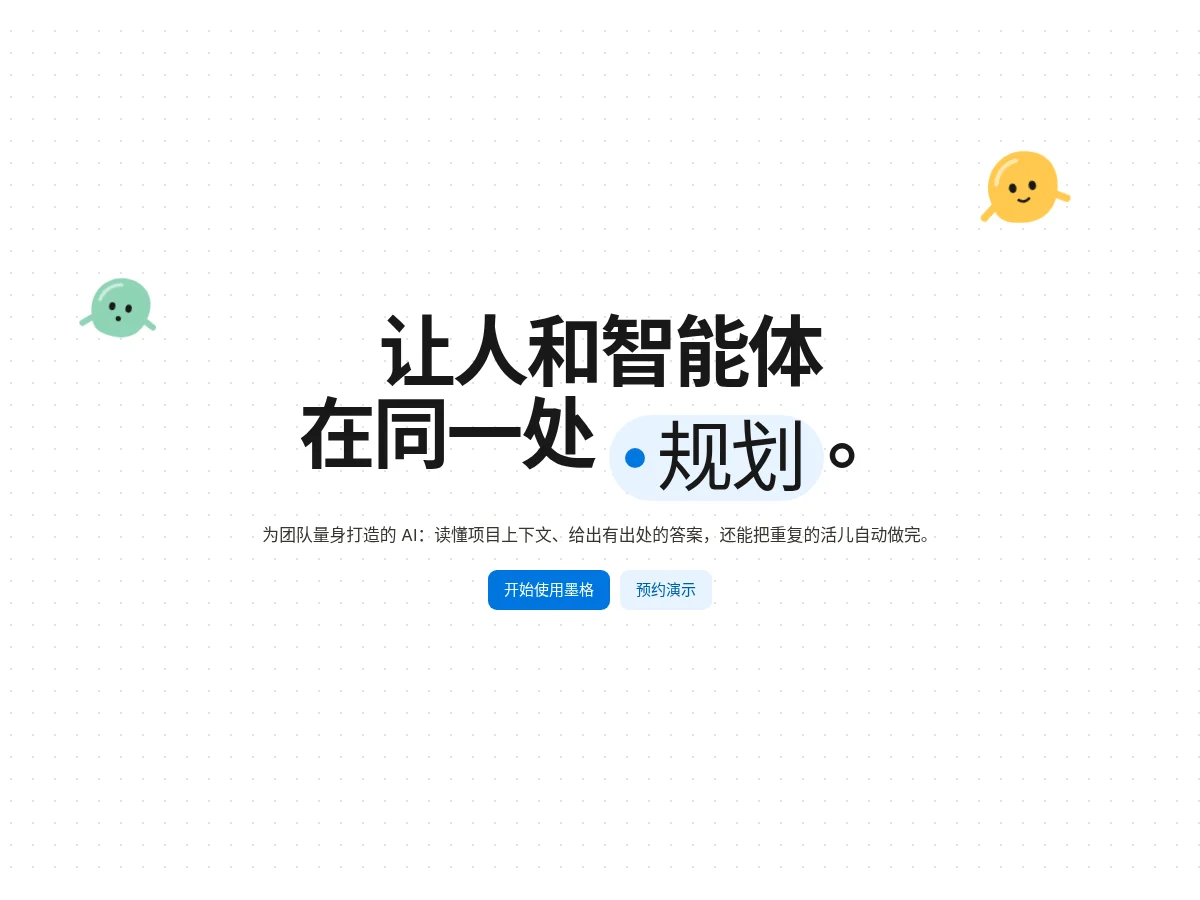
- Pill Word Hero Pill Word Hero
An extra-bold two-line headline with a light blue pill inside the sentence: its dot breathes and the word in it rolls through alternatives. An original flat pebble character sways on each side, with a line of copy and blue and light blue buttons below.
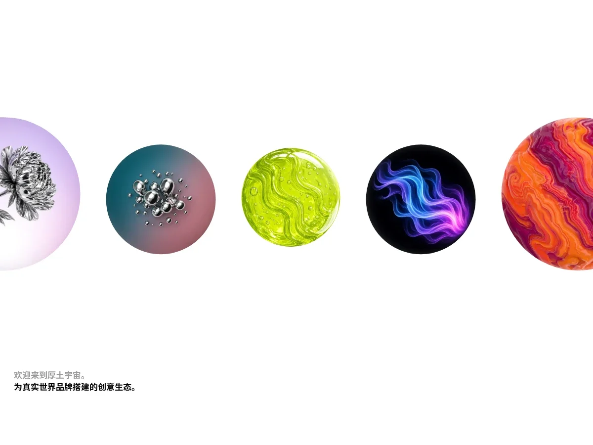
- Orbit Sphere Marquee Orbit Sphere Marquee
A white hero where a row of rendered spheres in alternating sizes drifts slowly left, each bobbing gently with its surface rotating; the row pauses on hover. Two lines of intro text sit bottom left, a gray greeting and a black main line, with plenty of whitespace.
- Glow Prompt Hero Glow Prompt Hero
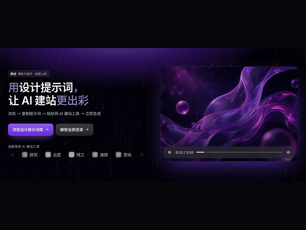
A dark hero: a violet glow breathes at the top while falling character rain is drawn on canvas behind. On the left a two-tone headline, a short process line, a gradient primary button and a marquee of tool names; on the right a pausable video player mockup with a live progress bar and timestamp.
- Sky Hero Headline Sky Hero Headline
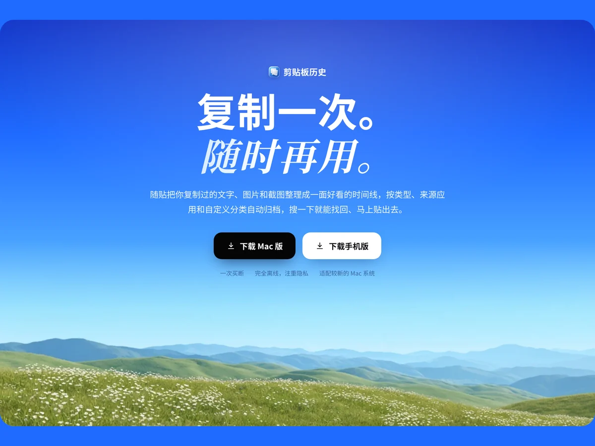
A blue-sky gradient hero: app badge on top, a bold Copy once. paired with a serif italic Use anytime. across two lines, then copy, black and white download buttons and three selling points, over a grassy hills image with a slowly breathing highlight at the top.
- Network Lines Hero Network Lines Hero
A warm gray hero: fine lines from both sides converge like a network on a URL input in the middle, with green sparks flowing along them. Stat pills roll at the top, with a green highlighted headline, two description pills and an arrow button that lights up only after you type.
- Portfolio Intro Hero Portfolio Intro Hero
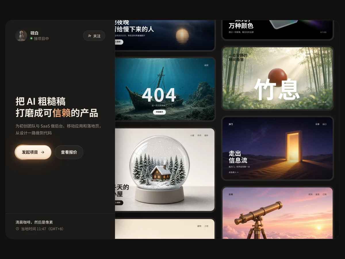
A profile column on the left with avatar, availability status, follow button, big headline and a light-streak primary button, with the live local time at the bottom; on the right two columns of work cards scroll slowly in opposite directions and pause on hover. Made for an independent designer portfolio hero.
- Inline Icon Hero Inline Icon Hero
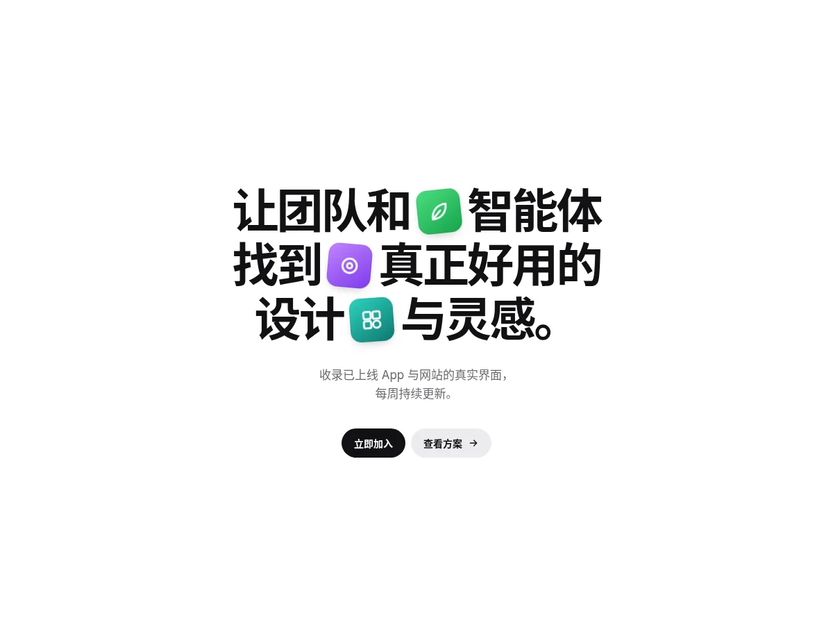
Three tilted icon slots embedded in an oversized centered headline, each popping up a different rounded app icon in turn and straightening and growing on hover, with a line of copy and black and white pill buttons below. Made for asset library and inspiration site heroes.
- Binary Command Hero Binary Command Hero
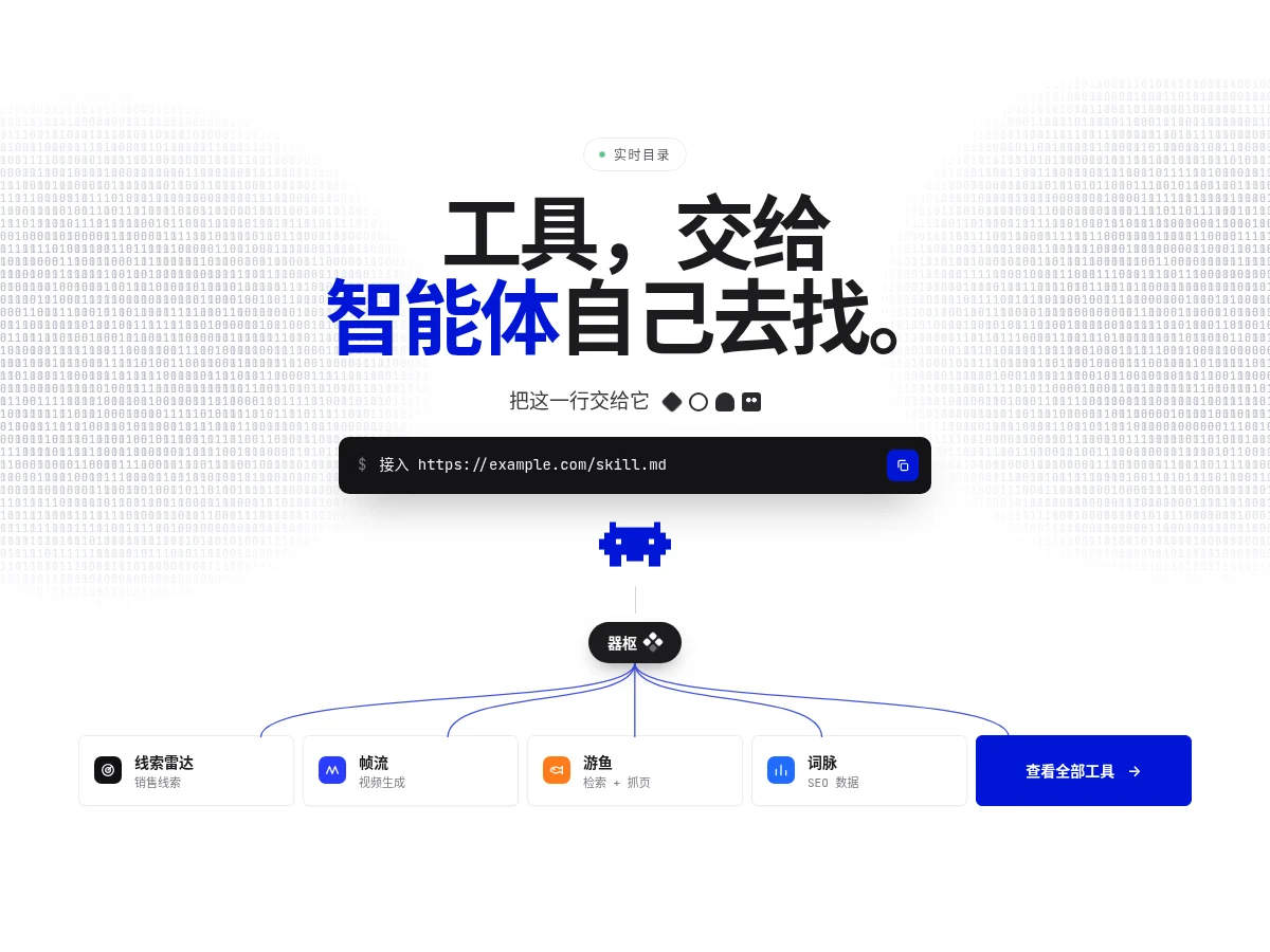
A white hero: binary texture fading at both sides twinkles slowly, a one-click copy command box sits under an oversized headline, and a pixel robot branches through node pills with curves into a row of tool cards. Good for AI tools and developer platforms.
- Floating Folders CTA Floating Folders CTA
A closing call-to-action: centered headline and primary button, surrounded by colorful glass folders that float gently and shift with a subtle parallax as the pointer moves.
- Gradient Mesh Hero Gradient Mesh Hero
A fluid background of drifting radial gradients with fine grain, headline and buttons centered.
FAQ
Can I use 8pt hero components in React, Vue or Next.js projects?
Yes. Component source is native HTML, CSS and a little JS. Hand the copied prompt to your model and it rewrites the component for your stack in React, Vue, Svelte and so on, wiring colors and fonts to your existing design tokens.
How do I add hero components to my project?
Three ways: copy the prompt on the component page for your model; run it with the 8pt CLI 8pt add <Components slug>; or connect 8pt MCP and just describe what you need in the chat. Copying prompts, the CLI and MCP need the Builder plan (Builder is $9//month, $25//quarter or $ $75//year; there’s alsoFounding Lifetime $179, one payment, limited to 100 seats).
What should go in a hero?
A headline that states the value in one line, one supporting sentence, one primary button (plus a secondary one if needed), and a real product shot or a restrained animated background. The less a hero says, the more the primary button gets clicked.
Can I use them in commercial projects?
Yes. You can use code you copy or install in your own projects, including commercial ones, but you can’t resell 8pt content as a whole or build a competing asset library with it.