Component categories · Navigation
Navigation components
Site headers, dropdown menus, tab switches, segmented controls and footers. Clearly structured and keyboard accessible; copy the prompt to add them to your project.
11 total · Updated
Where to use them
Site headers, tab switches, segmented controls, side navigation and footers.
How to use them
- Open any component to see its live preview and switch between dark and light backgrounds.
- Click Copy prompt and paste it into Claude Code, Cursor, Codex or Trae. The model reads your project, rewrites the component for your framework and wires colors and fonts to your design tokens.
- Or install them from your terminal with the 8pt CLI, or just describe what you need in an editor connected to 8pt MCP.
npm i -g @8pt-dev/cli
8pt login
8pt search "Navigation"
8pt add gradient-footer-panel
All 11 navigation components
- Gradient Footer Panel Gradient Footer Panel
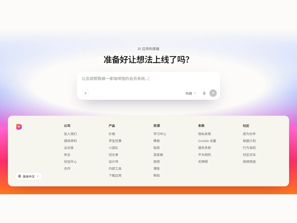
A closing section: small label, call-to-action headline and an input with a typed placeholder, over a vertical gradient from off-white into blue, pink, red and orange. Below, a beige rounded footer card with logo, five link columns and a language menu that opens upward.
- Pill Dropdown Header Pill Dropdown Header
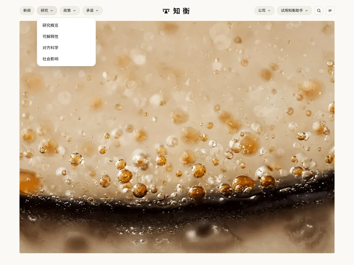
A research-lab page header on warm white: two groups of light gray pill buttons with dropdowns on either side, a balance-scale emblem and airy wordmark in the middle that collapses to just the emblem on scroll; search and menu buttons on the right, and an emblem with a full-screen menu on narrow screens.
- Motto Column Footer Motto Column Footer
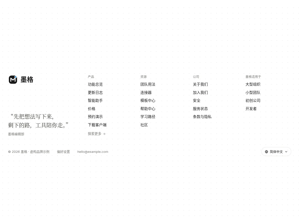
A white footer: large logo and a serif motto on the left, four grouped link columns on the right, a bottom row with copyright, preferences and a sample email, and a language pill bottom right that opens a menu upward and switches the label.
- Pill Link Footer Pill Link Footer
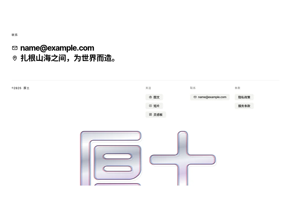
A closing contact-plus-footer combo: two bold lines of contact copy under a monospace label, then a hairline divider with monospace copyright on the left and follow, contact and terms columns on the right, every link a light gray pill with a small line icon. Half of a mirrored outline wordmark peeks out at the bottom.
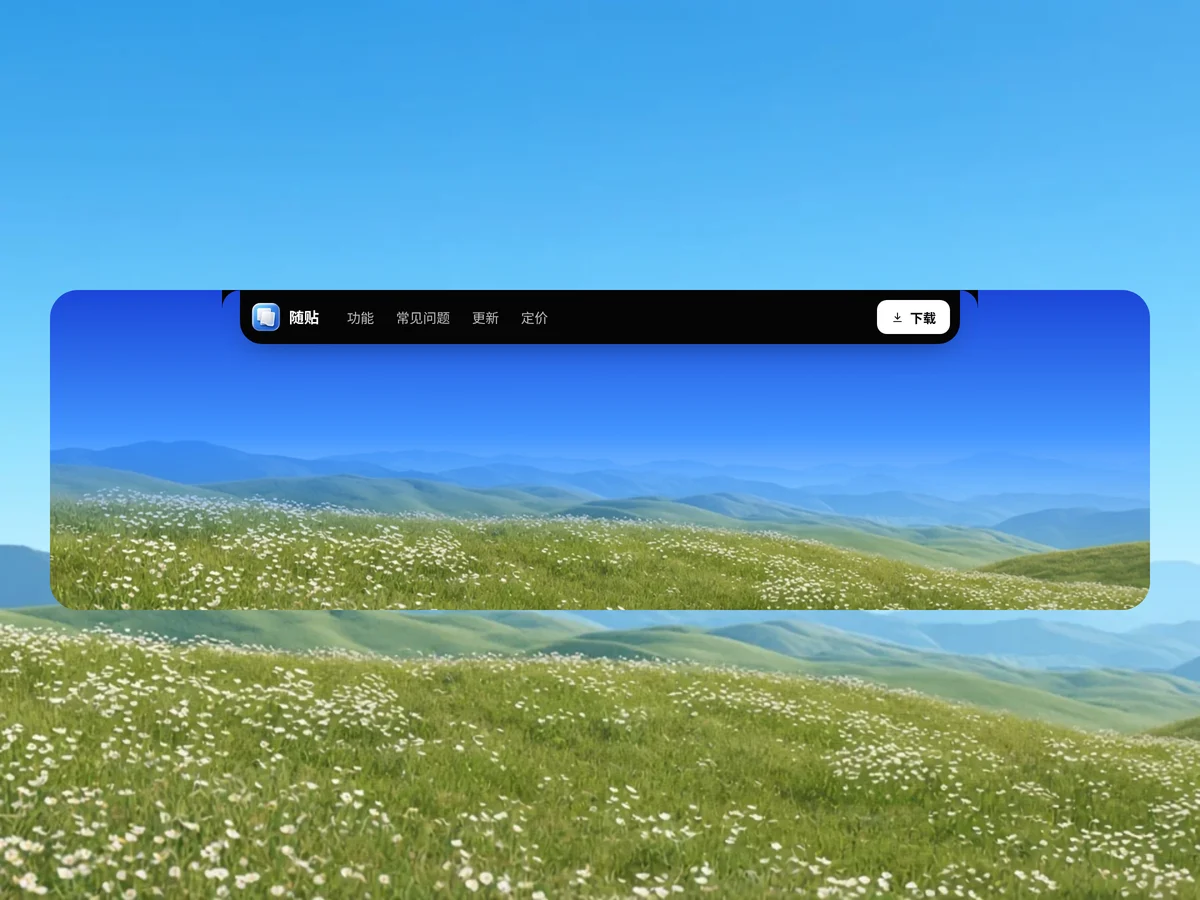
- Notch Pill Nav Notch Pill Nav
A black notch-pill navigation stuck to the top of the screen: app icon and name on the left, links to features, FAQ, updates and pricing in the middle, a white download button on the right. Concave rounded shoulders on both sides; on narrow screens it folds into a hamburger with a dropdown.
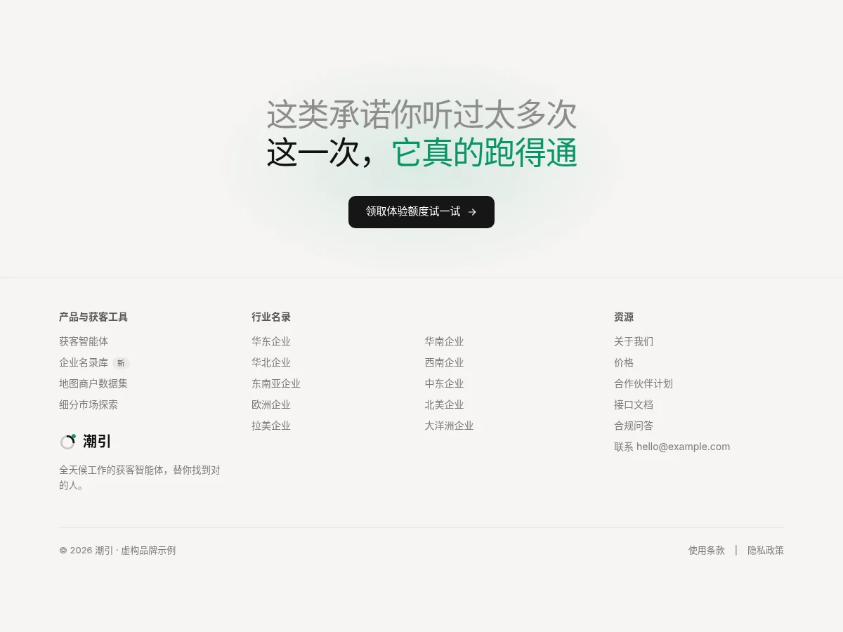
- Closing CTA Footer Closing CTA Footer
A two-line closing headline in a gray subline plus green emphasis with a black button, over a slowly breathing green glow. Below, a three-column hairline footer with an industry directory in two columns in the middle and copyright and terms in the bottom row.
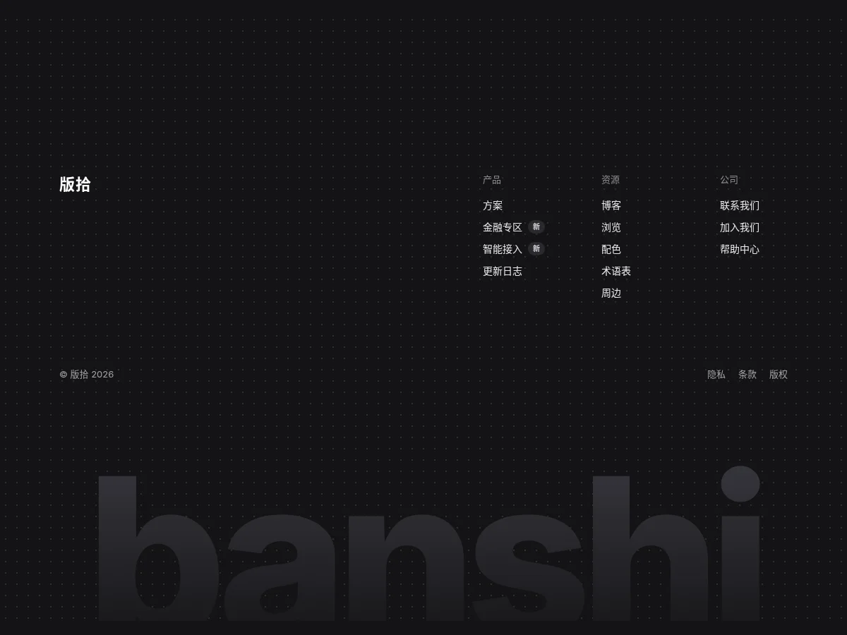
- Giant Wordmark Footer Giant Wordmark Footer
A dark footer with rounded top edges: brand name on the left, three link columns with New badges on the right, a bottom row with copyright and terms links, and an oversized wordmark at the very bottom, nearly the color of the background and cut off at half height.
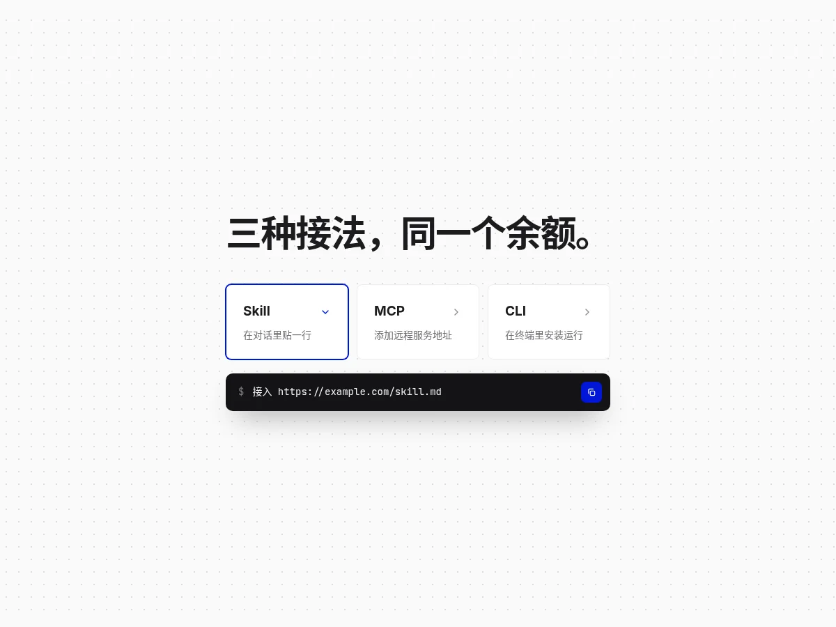
- Connect Way Tabs Connect Way Tabs
Three integration option cards act as tabs: the selected card gets an accent border and its arrow turns, the command box below fades to match, and it copies in one click. Good for docs entry points and install guides.
- Animated Tabs Animated Tabs
The indicator follows the active tab with transform translate and scale; panels fade in and rise.
- Segmented Control Segmented Control
Equal-width segments with a slider that springs into place; the content below fades in. Arrow keys switch segments.
- Stepper Stepper
A multi-step progress indicator: connectors fill with progress, finished steps turn into checks and the current step has a breathing ring. Comes with Back / Next.
FAQ
Can I use 8pt navigation components in React, Vue or Next.js projects?
Yes. Component source is native HTML, CSS and a little JS. Hand the copied prompt to your model and it rewrites the component for your stack in React, Vue, Svelte and so on, wiring colors and fonts to your existing design tokens.
How do I add navigation components to my project?
Three ways: copy the prompt on the component page for your model; run it with the 8pt CLI 8pt add <Components slug>; or connect 8pt MCP and just describe what you need in the chat. Copying prompts, the CLI and MCP need the Builder plan (Builder is $9//month, $25//quarter or $ $75//year; there’s alsoFounding Lifetime $179, one payment, limited to 100 seats).
How many links should a site header have?
Keep top-level links to about five and move secondary ones into a dropdown or the footer. Keep one key action button on the right, such as Get started.
Can I use them in commercial projects?
Yes. You can use code you copy or install in your own projects, including commercial ones, but you can’t resell 8pt content as a whole or build a competing asset library with it.