Component categories · Text
Text and heading components
Typewriter headlines, text scramble, testimonials and large-type layouts, to give hero headlines and key copy some personality.
7 total · Updated
Where to use them
Animated headlines, testimonials, emphasis copy and large-type layouts.
How to use them
- Open any component to see its live preview and switch between dark and light backgrounds.
- Click Copy prompt and paste it into Claude Code, Cursor, Codex or Trae. The model reads your project, rewrites the component for your framework and wires colors and fonts to your design tokens.
- Or install them from your terminal with the 8pt CLI, or just describe what you need in an editor connected to 8pt MCP.
npm i -g @8pt-dev/cli
8pt login
8pt search "Text and headings"
8pt add suiyun-tab-quote
All 7 text and heading components
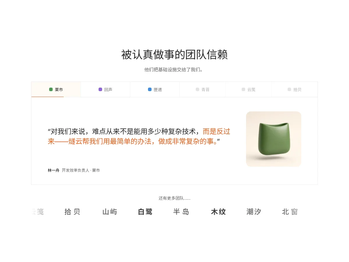
- Tabbed Logo Testimonial Tabbed Logo Testimonial
A testimonial card under a centered headline: a row of fictional brand tabs on top, and when the orange progress bar under the active tab fills it moves to the next company. The large quote ends in an orange highlight, with attribution and a small 3D illustration; gray wordmarks drift sideways below and pause on hover.
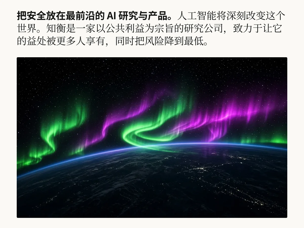
- Serif Statement Hero Serif Statement Hero
A manifesto-style hero headline in one paragraph: the opening sentence in bold sans-serif, the rest flowing on in a serif text face, each phrase fading in from blur. Large size, tight leading, made for a research lab or brand mission opener.
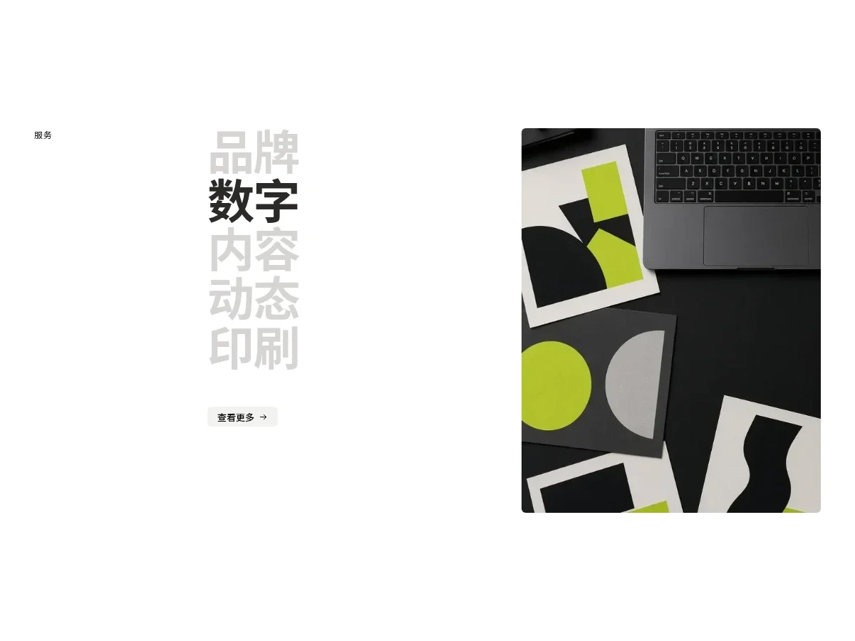
- Hover Service Index Hover Service Index
A three-column services index: a monospace label on the left, a column of large bold service names in the middle (light gray until hovered or focused, then black), and a tall image on the right that crossfades and scales slightly to match. With no interaction it rotates through the list.
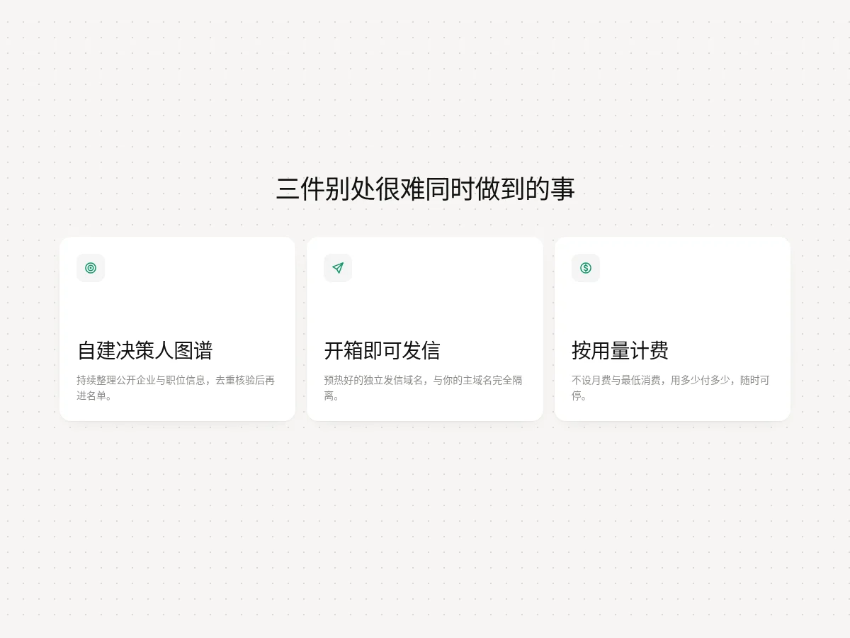
- Three Claim Cards Three Claim Cards
Three equal white cards under a centered headline, each with a light gray icon top left, a large value headline and a gray line of copy at the bottom. Cards lift on hover with a faint green glow in the top right corner.
- Hover Preview Hover Preview
Hover a keyword in body text and a preview card floats out next to the pointer. The card content is drawn in pure CSS.
- Text Scramble Text Scramble
Text decodes from random characters into the target word one letter at a time, on entering the viewport and on hover.
- Typewriter Heading Typewriter Heading
The keyword at the end of the headline types out, pauses and deletes, cycling through several words. Blinking caret; characters appear with opacity, no jitter.
FAQ
Can I use 8pt text and heading components in React, Vue or Next.js projects?
Yes. Component source is native HTML, CSS and a little JS. Hand the copied prompt to your model and it rewrites the component for your stack in React, Vue, Svelte and so on, wiring colors and fonts to your existing design tokens.
How do I add text and heading components to my project?
Three ways: copy the prompt on the component page for your model; run it with the 8pt CLI 8pt add <Components slug>; or connect 8pt MCP and just describe what you need in the chat. Copying prompts, the CLI and MCP need the Builder plan (Builder is $9//month, $25//quarter or $ $75//year; there’s alsoFounding Lifetime $179, one payment, limited to 100 seats).
Does headline motion hurt readability?
Use motion only on the hero or one or two key headlines, and let text stay still and readable once the animation ends. Don’t animate body paragraphs.
Can I use them in commercial projects?
Yes. You can use code you copy or install in your own projects, including commercial ones, but you can’t resell 8pt content as a whole or build a competing asset library with it.