Component categories · Inputs
Input and form components
Search boxes, AI chat inputs, form fields, file uploads and verification code inputs. Each one handles focus, keyboard and state feedback.
12 total · Updated
Where to use them
Search boxes, AI chat inputs, form fields, file uploads, verification codes and anywhere else people type.
How to use them
- Open any component to see its live preview and switch between dark and light backgrounds.
- Click Copy prompt and paste it into Claude Code, Cursor, Codex or Trae. The model reads your project, rewrites the component for your framework and wires colors and fonts to your design tokens.
- Or install them from your terminal with the 8pt CLI, or just describe what you need in an editor connected to 8pt MCP.
npm i -g @8pt-dev/cli
8pt login
8pt search "Inputs and forms"
8pt add search-suggest-panel
All 12 input and form components
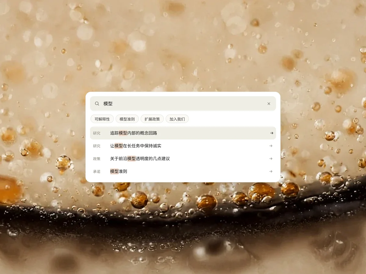
- Search Suggest Panel Search Suggest Panel
A white rounded site search panel: input with a clear button, popular-term pills that fill it in one click, and a results list that filters live and highlights matches. Arrow keys move the selection, with a message when nothing matches.
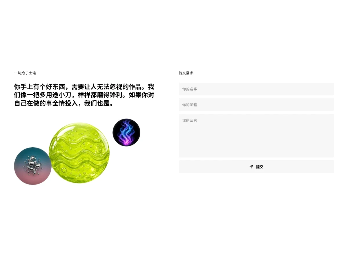
- Split Enquiry Form Split Enquiry Form
A two-column inquiry section: a monospace label, a bold manifesto and a few slowly floating rendered spheres on the left; name, email and message fields on light gray with a full-width submit button on the right. Fields get a fine outline on focus, the button turns neon yellow on hover and a sample receipt appears in place after submitting.
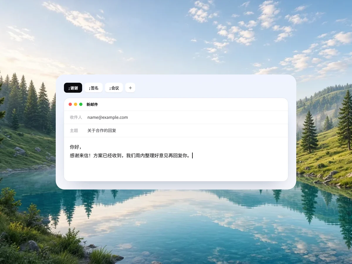
- Inline Shortcut Typer Inline Shortcut Typer
A text shortcut demo inside an email editor: type a semicolon plus a shortcut name, a replacement hint pops up and expands into a full paragraph. Tabs on top switch between thanks, signature and meeting shortcuts; the typing loops, or click to trigger it yourself.
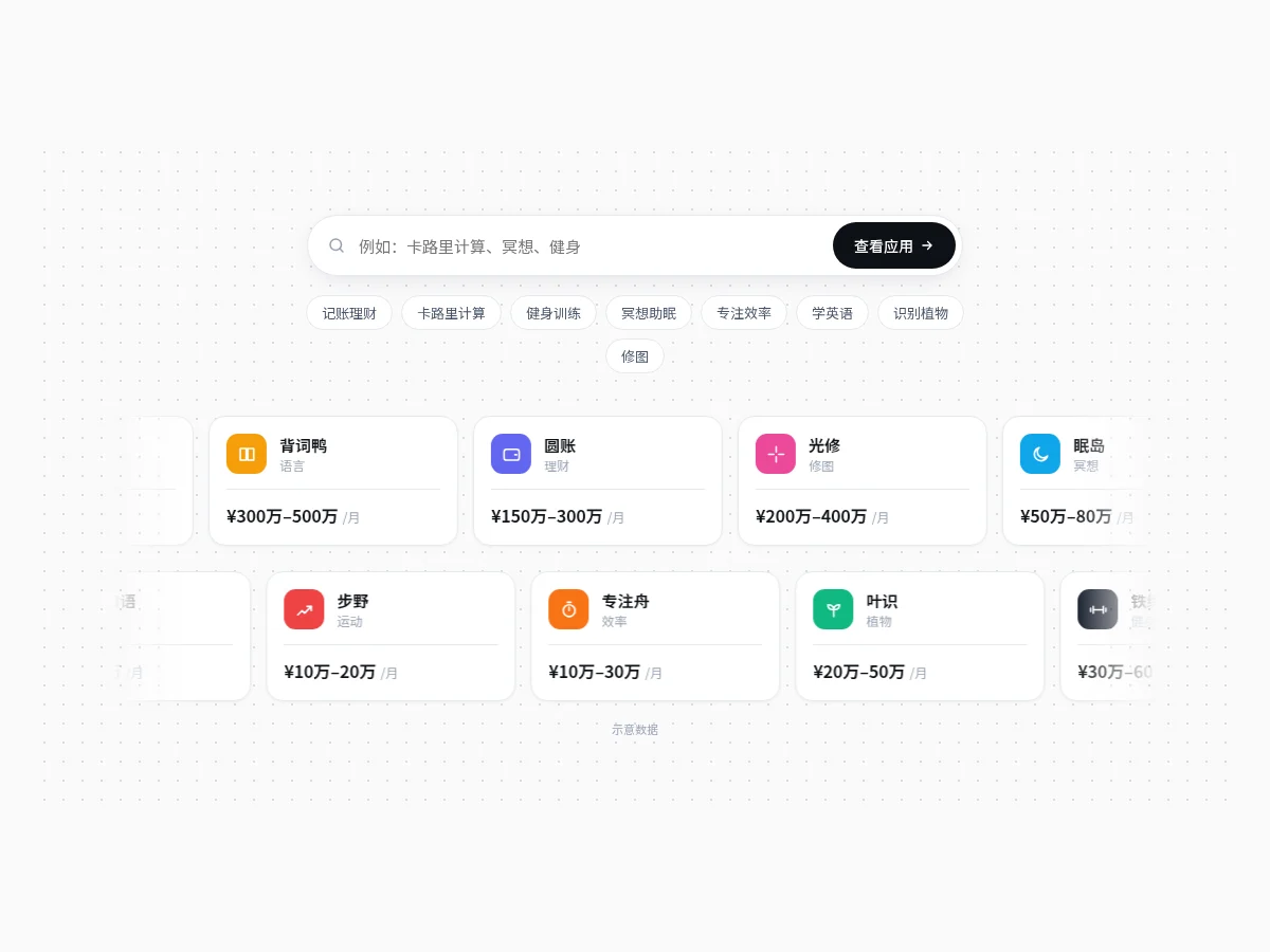
- Idea Search Marquee Idea Search Marquee
A pill search box with quick-term tags above a marquee of app cards that fades at both ends and pauses on hover. Clicking a tag fills the search box, highlights cards of that kind and dims the rest. Made for a Try it first block on a tool site home page.
- Project Brief Form Project Brief Form
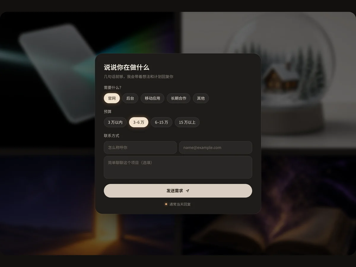
A project inquiry form in a dark panel: project type and budget switch with radio pills, and the name, email and description fields light up with a warm outline on focus. Sending clears the form and slides in a received notice at the top. It never actually submits.
- AI Prompt Composer AI Prompt Composer
The prompt composer from an AI generation hero: video, image and agent modes with a sliding indicator. Example prompts type themselves in, first- and last-frame slots plus model and setting pills change with the mode, the send key lights up once there is input, and quick tags below fill in a prompt in one click.
- AI Prompt Input AI Prompt Input
An auto-growing prompt input with a model switcher, attachment button and sending state. The placeholder cycles through things you can ask for.
- Glowing Search Bar Glowing Search Bar
A rotating conic gradient shows only a 1.5px border, with a stronger glow on focus and a ⌘K shortcut.
- Command Palette Command Palette
An inline command palette: typing filters, arrow keys move the highlight, Enter runs it. The highlight moves with transform, so the list never reflows.
- File Dropzone File Dropzone
Drop files or click to pick them; the border lights up and grows while dragging over. Each file gets its own progress bar and a check when done. Includes a sample-files button.
- OTP Input OTP Input
A six-box verification code input: auto-advances while typing, steps back on backspace and spreads a pasted code across the boxes. Validates when full: shakes on error, turns green when correct.
- Date Range Pill Date Range Pill
A pill shows the selected range; pick start and end days on the mini calendar below. The range highlights as one band, hover previews it and the day count updates automatically.
FAQ
Can I use 8pt input and form components in React, Vue or Next.js projects?
Yes. Component source is native HTML, CSS and a little JS. Hand the copied prompt to your model and it rewrites the component for your stack in React, Vue, Svelte and so on, wiring colors and fonts to your existing design tokens.
How do I add input and form components to my project?
Three ways: copy the prompt on the component page for your model; run it with the 8pt CLI 8pt add <Components slug>; or connect 8pt MCP and just describe what you need in the chat. Copying prompts, the CLI and MCP need the Builder plan (Builder is $9//month, $25//quarter or $ $75//year; there’s alsoFounding Lifetime $179, one payment, limited to 100 seats).
How do I help people make fewer form errors?
Keep labels visible, put error messages next to the field and say how to fix them, and autofill whatever you can. Inputs like verification codes and uploads need clear state feedback.
Can I use them in commercial projects?
Yes. You can use code you copy or install in your own projects, including commercial ones, but you can’t resell 8pt content as a whole or build a competing asset library with it.